My Website Before IndieWeb
PermalinkSince I created this website’s colophon (also known as meta page), I’ve wanted to also created a page that show cased how this website evolved over the years. I created this website when I was 14, in 2014. At first, it was just a bunch of HTML pages written by hand. Within the first year, the website moved from pure HTML to WordPress and then to Hugo.
To make this post more bearable - there are a lot of versions! - I decided to split it into two: before IndieWeb and after IndieWeb. I started getting into the IndieWeb back in 2020 and I think it is a good breaking point. Besides, there would be way too many images to put into a single post.
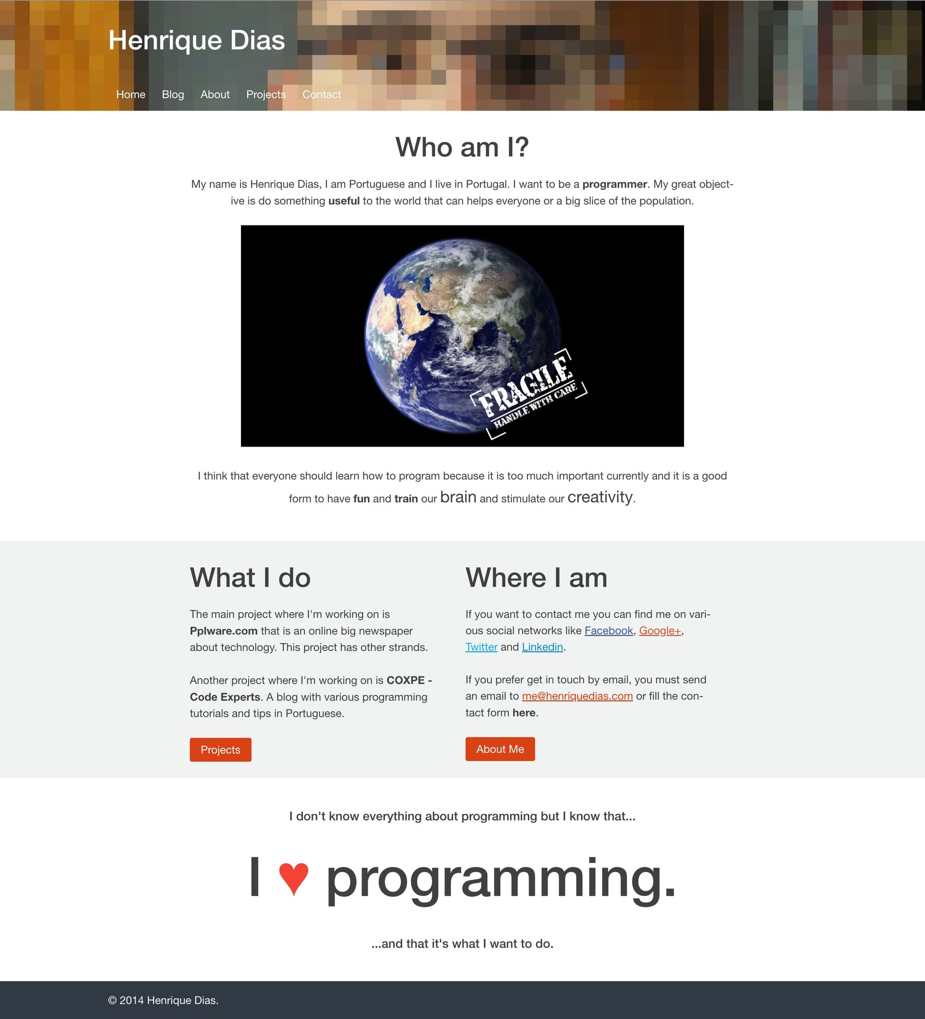
Back in 2014, I wasn’t using Git or any other version control systems. Also, while using WordPress, that would be infeasible and not make any sense. Thus, I don’t have backups from that time, except from the image above which I found on the Web Archive.
2015
In 2015, however, I ditched WordPress and replaced it by Hugo. Since I started using Hugo, I have also kept a repository in which I track all the changes of my website over the years. Therefore, this is the first year where I can actually show you how the website looked, at least in the beginning.
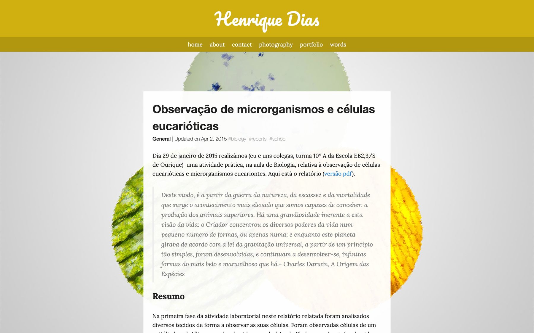
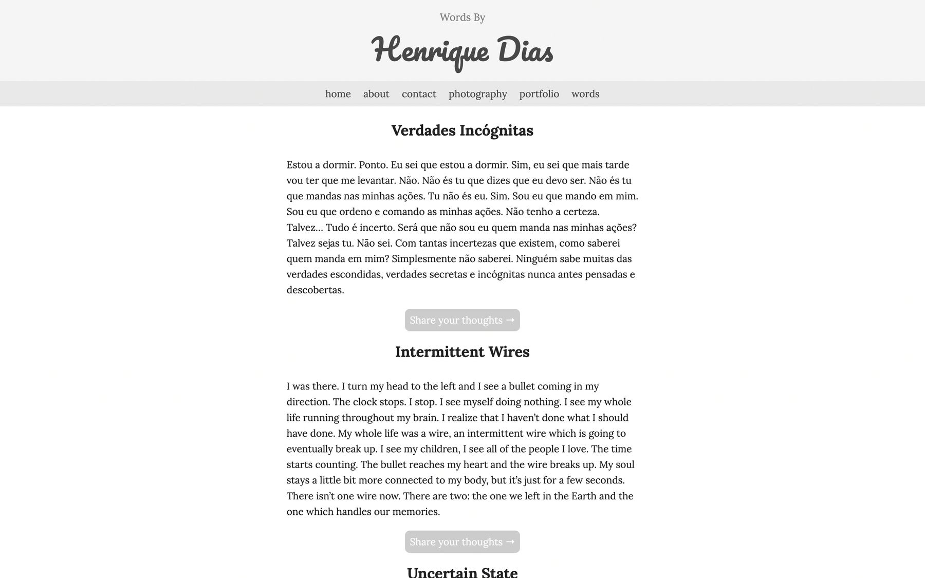
At the time, I was very into the parallax effect. Unfortunately, you can’t see it on the images below. For the home page, the images would stay in the same position while scrolling. On the articles page, the image would scroll slowly than the article, giving a depth effect. This was the first version of the website.
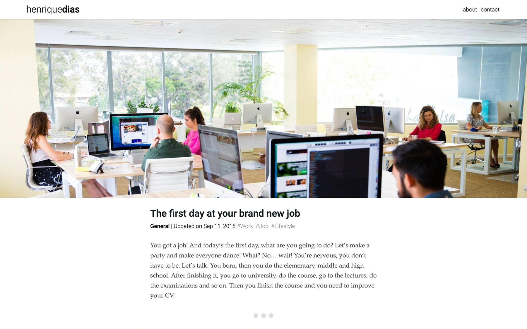
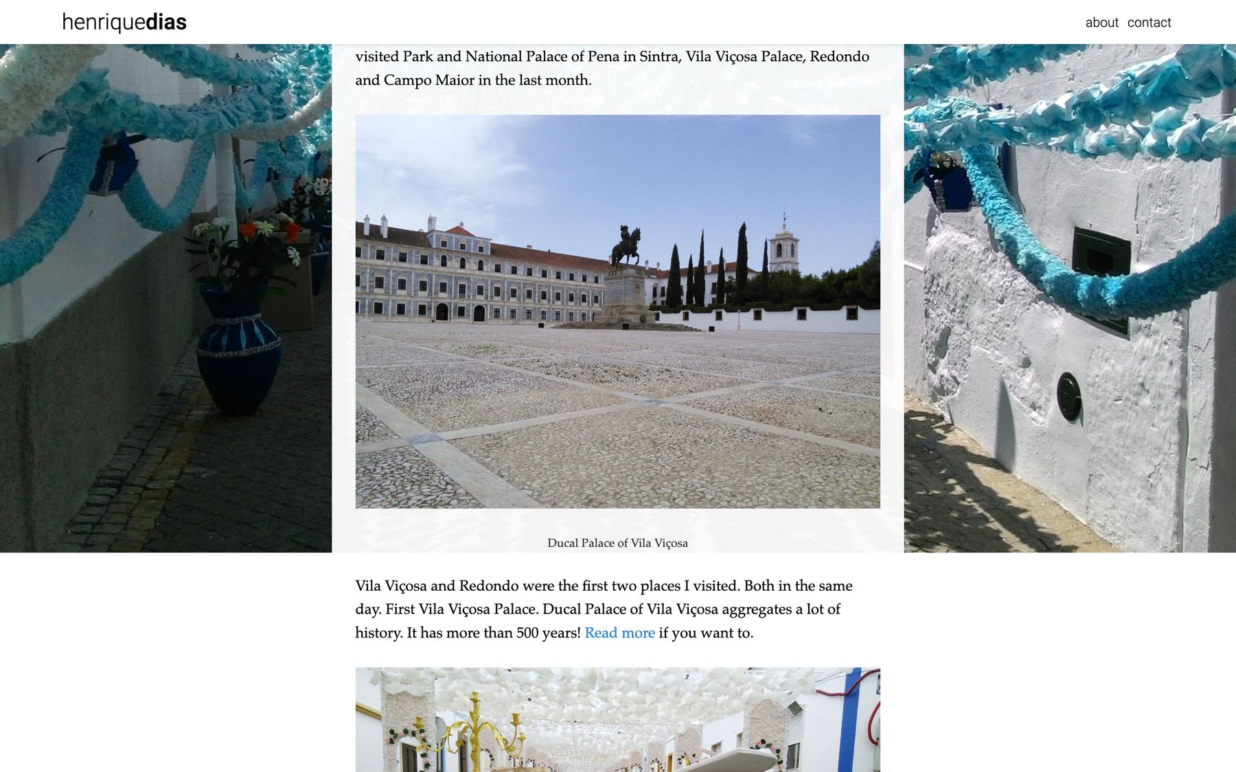
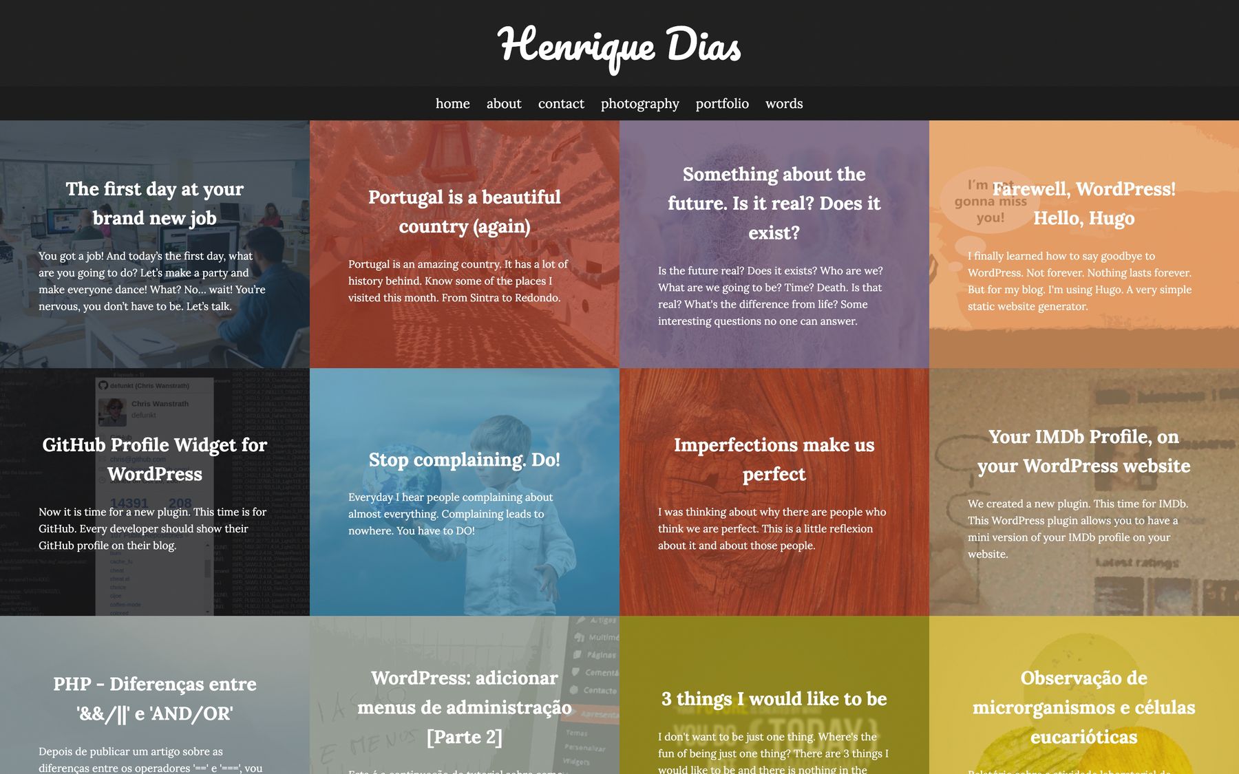
Months after, I made some drastic updates and decided to call it version 1.2. I really don’t know what I was doing by not calling this a major version. As you can see below, I changed the homepage dramatically to what looks like a bad photo collage. Each article and page would have its own accent color and I kept the parallax effect on the articles pages.
2016
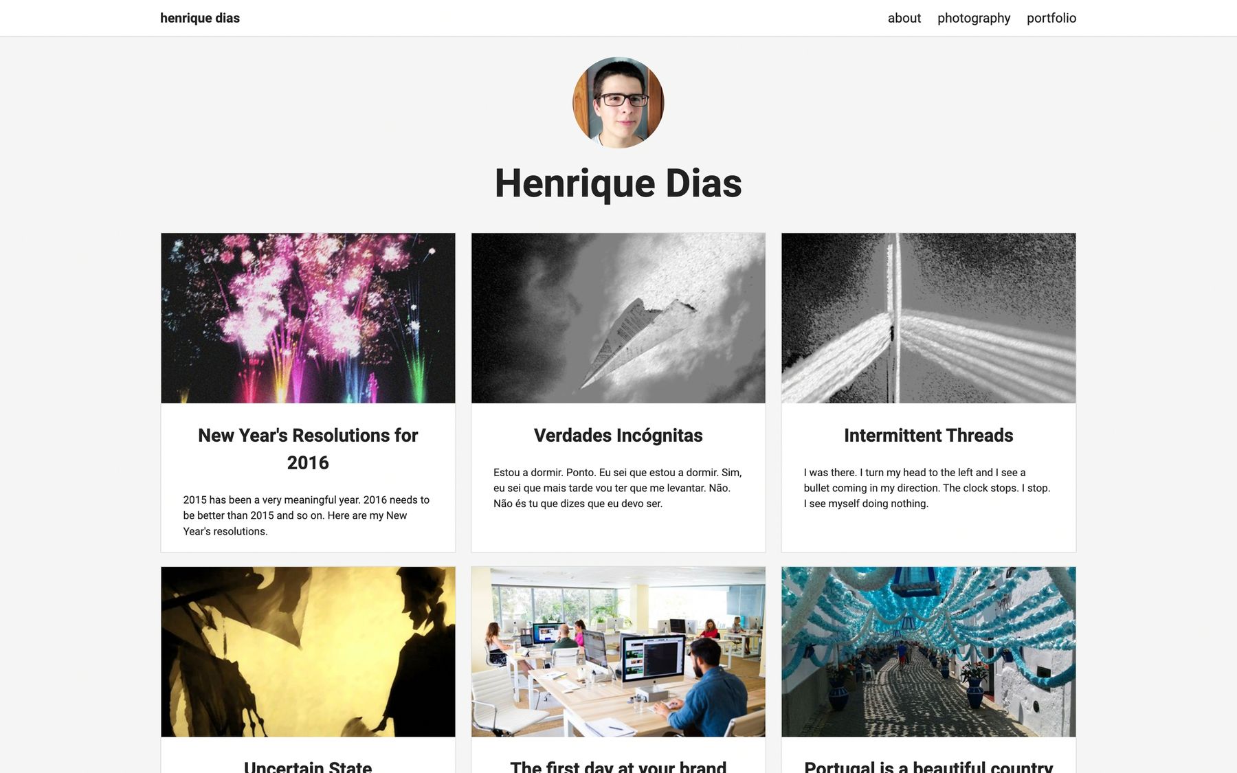
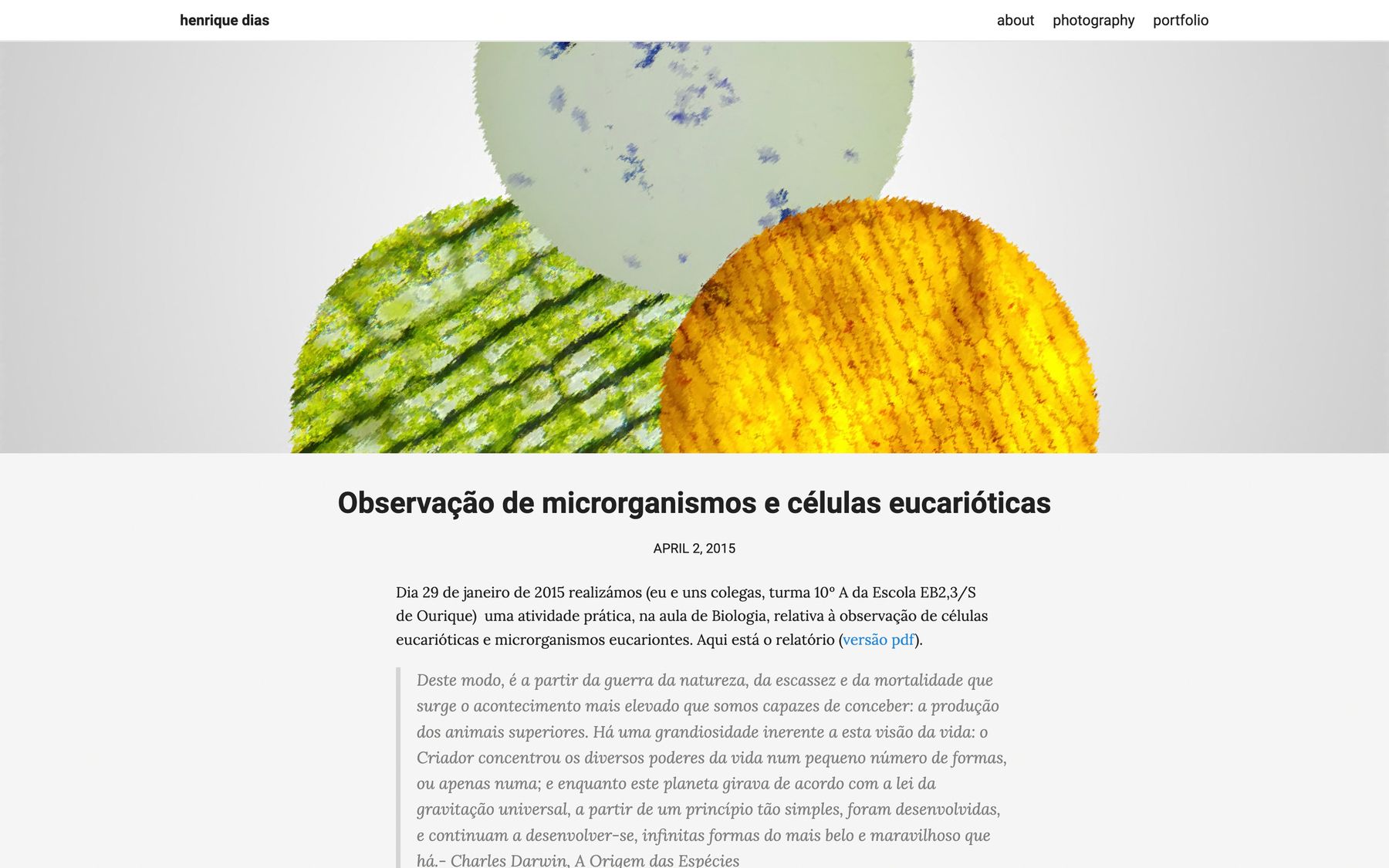
In 2016, I changed it enough to call it version 2. I went for a white-ish color scheme and kept the article lists as cards. I think this was something fairly common at the time and it’s still seen in many websites nowadays.
In this year, I made way too many major versions. I am skipping version 3 because I could not find a commit where it looked decent. Fast forwarding to version 4, I added an interactive command-line-like thing in the homepage where you could run some commands that would redirect you to the appropriate page. It seems I was into monospaced fonts at the time.
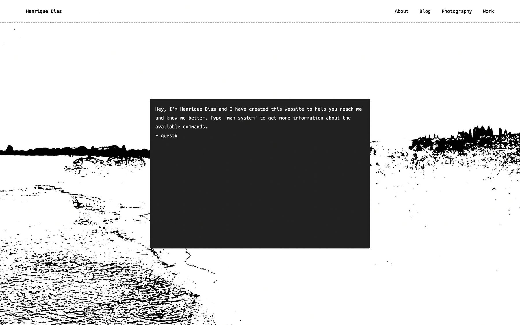
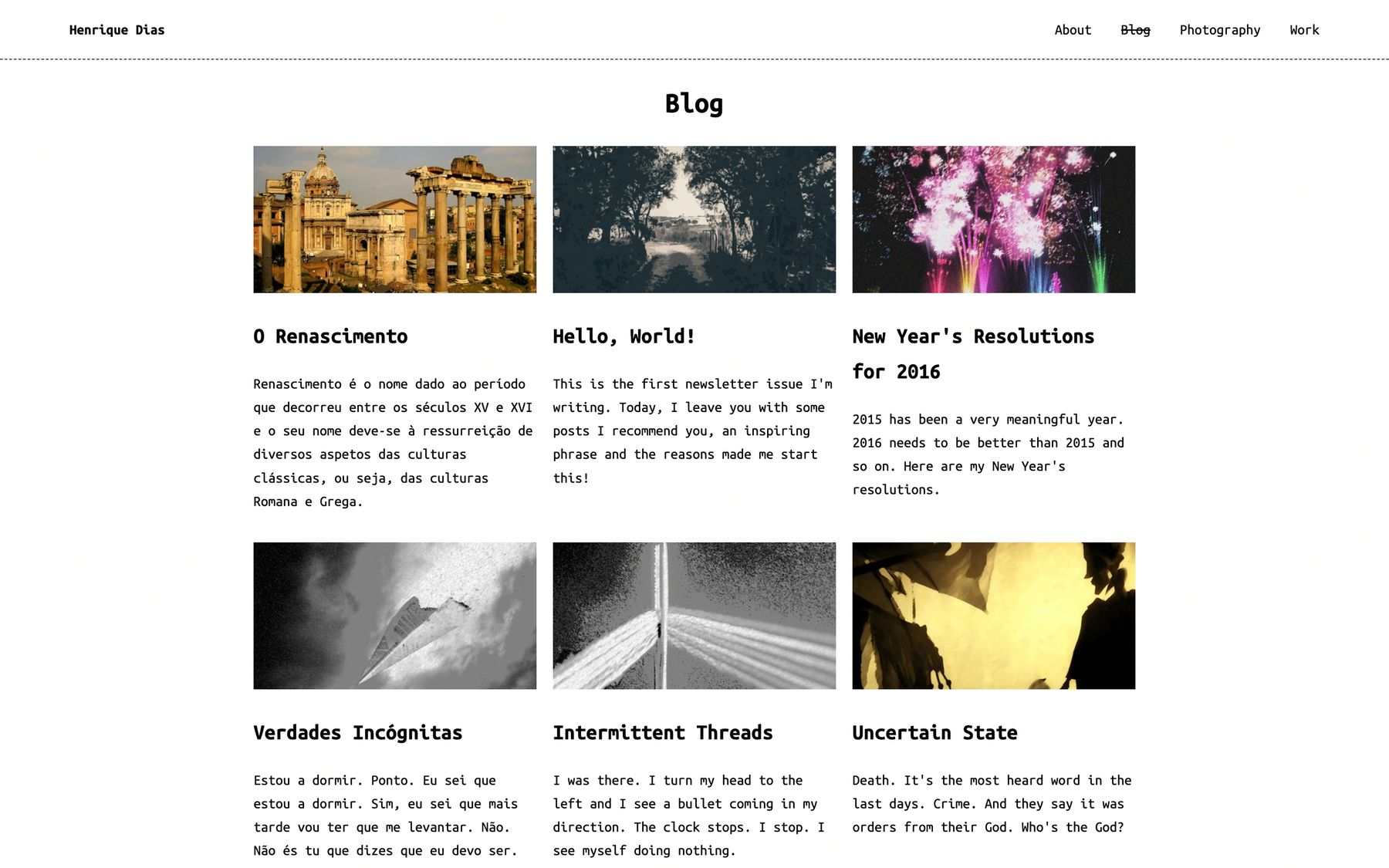
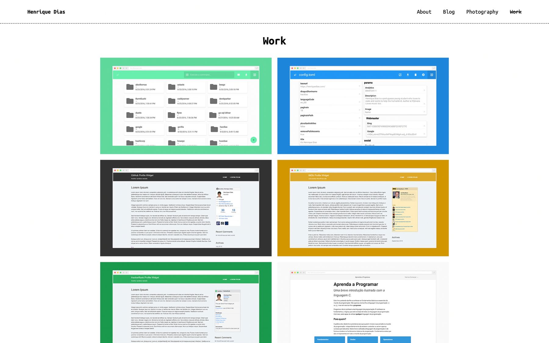
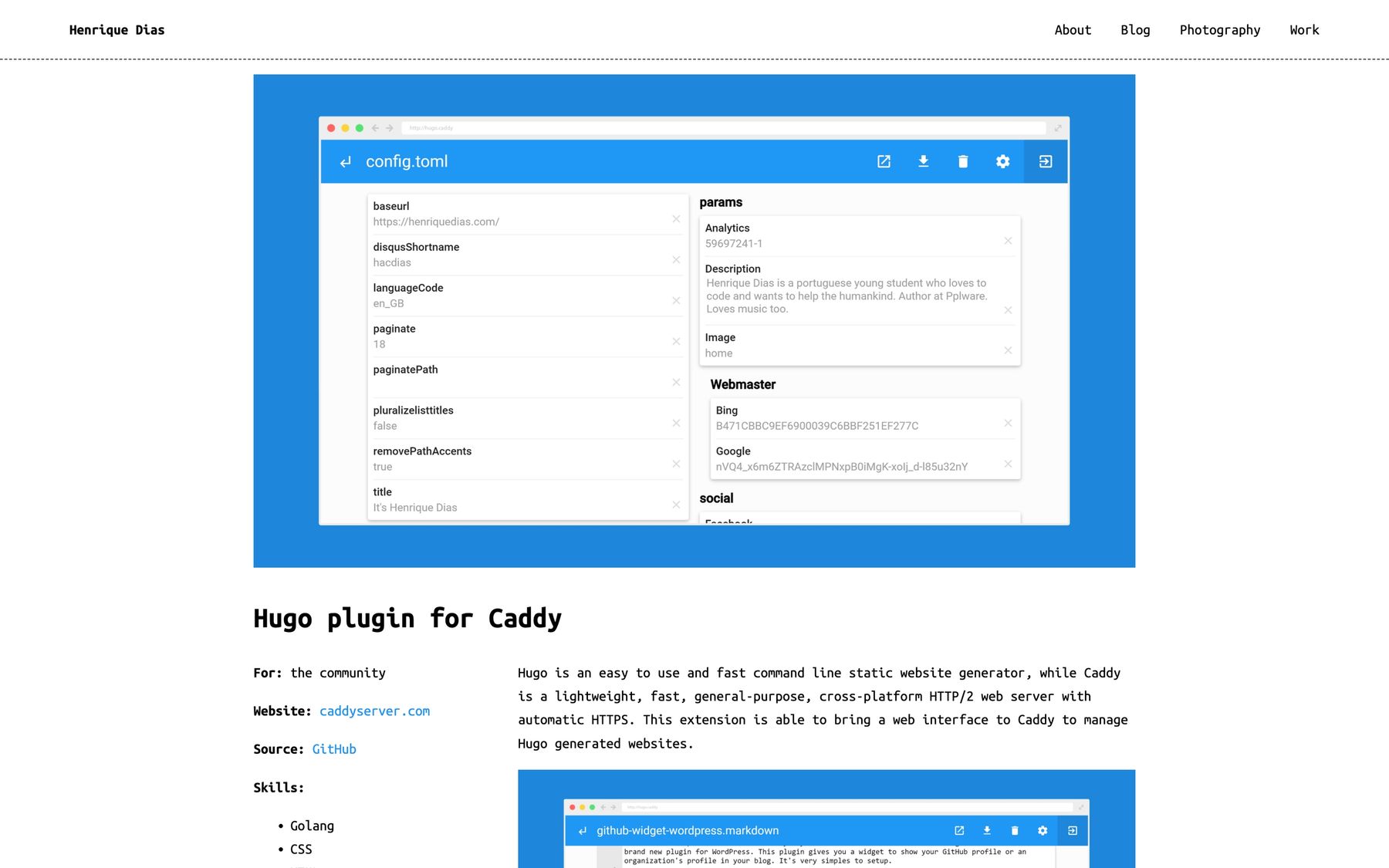
I made yet another revamp in 2016 - probably too much free time in my hands - where my homepage looked like a page out of those generic business card online website services, such as about.me. The styles of the remaining pages also changed, but not as dramatically as before.
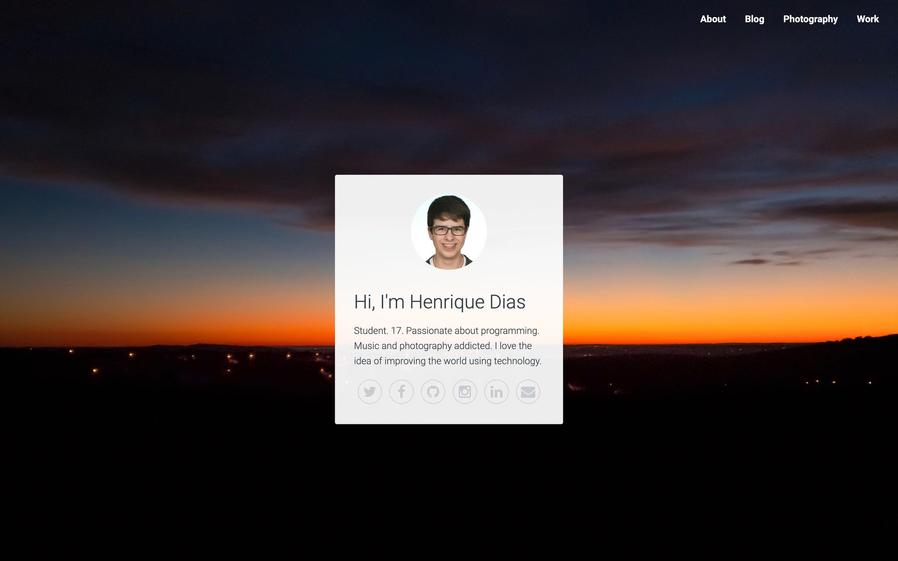
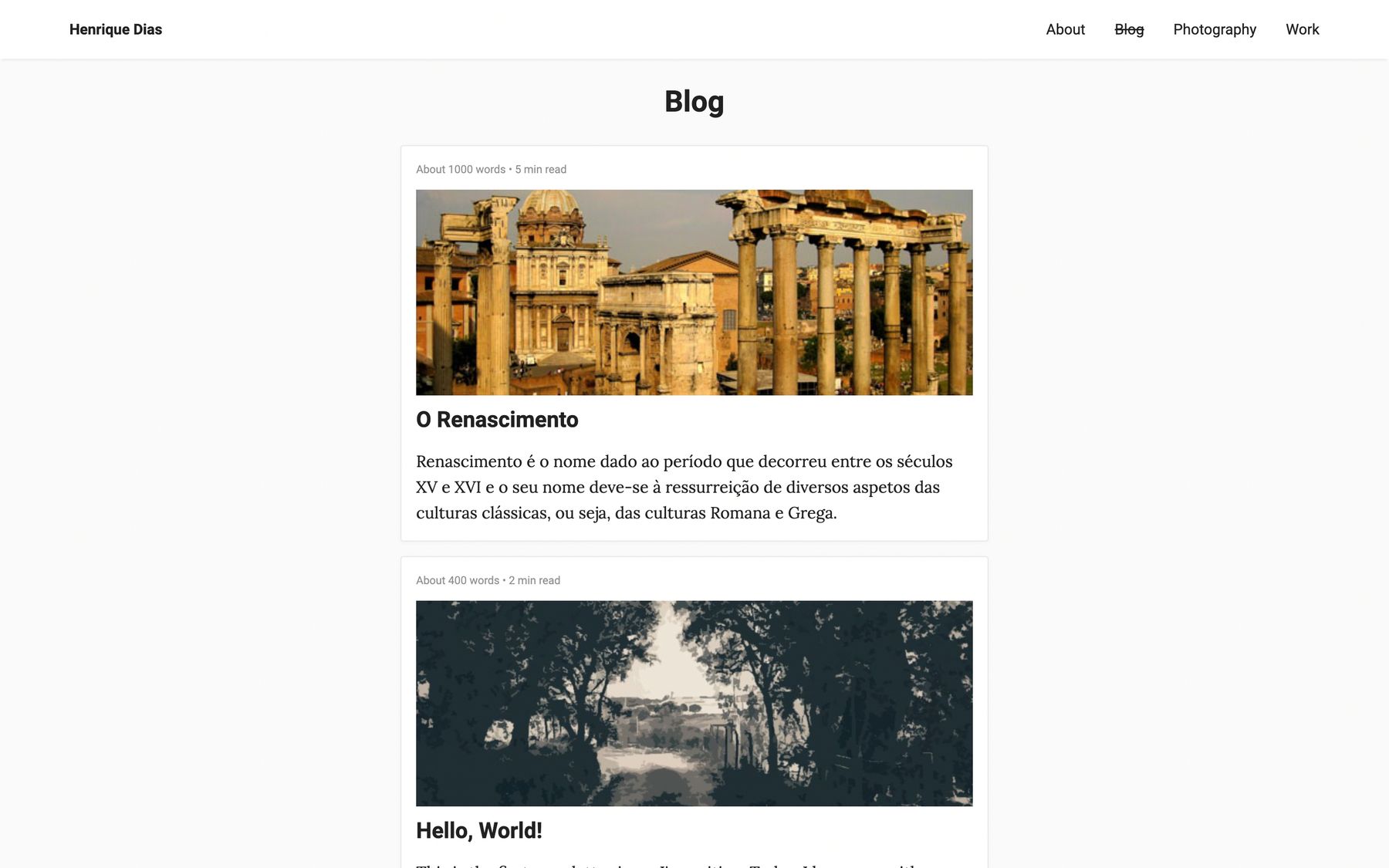
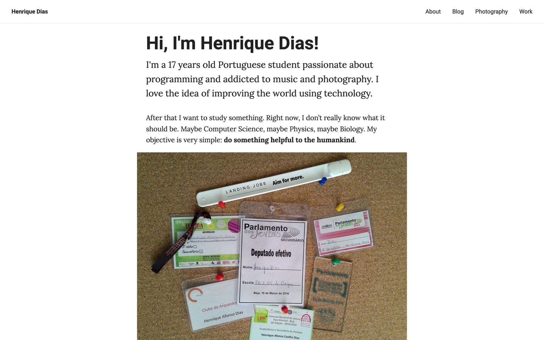
2017
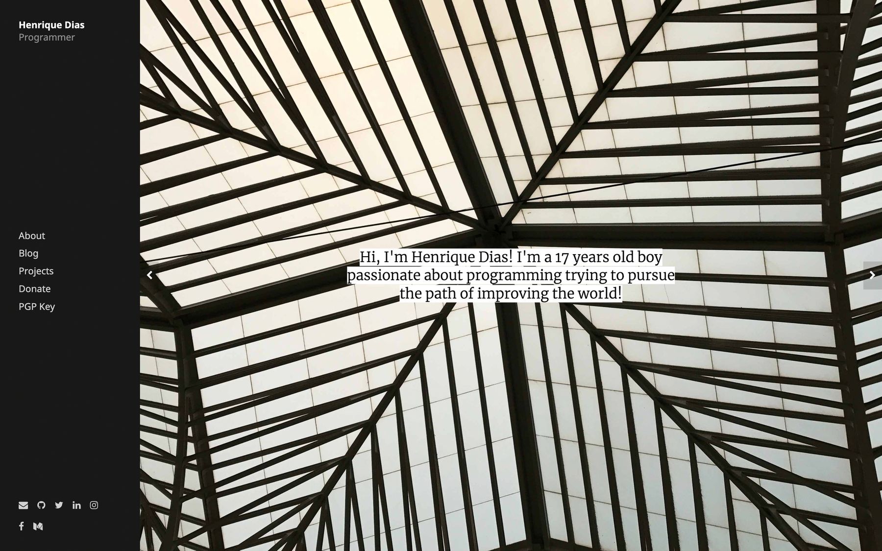
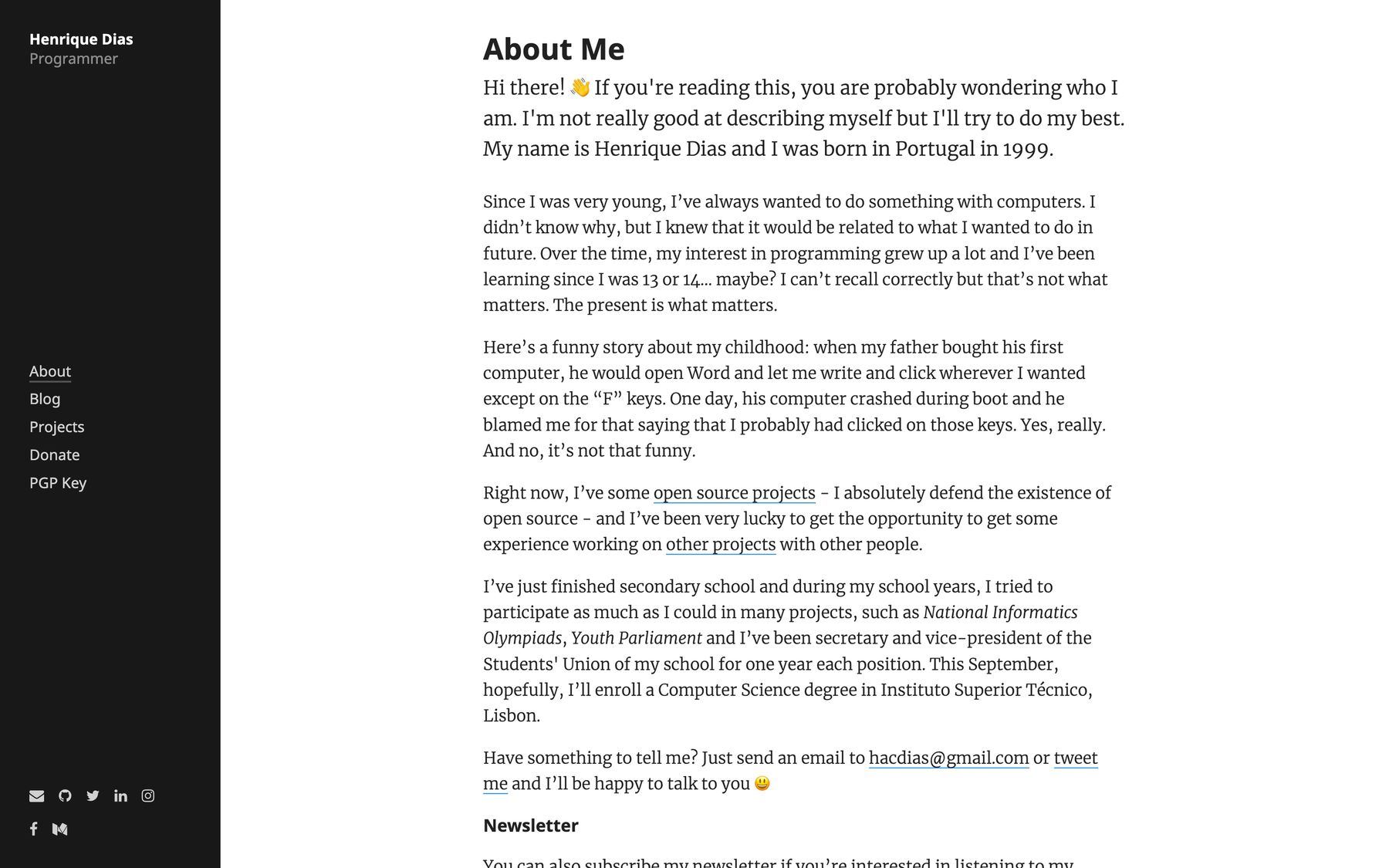
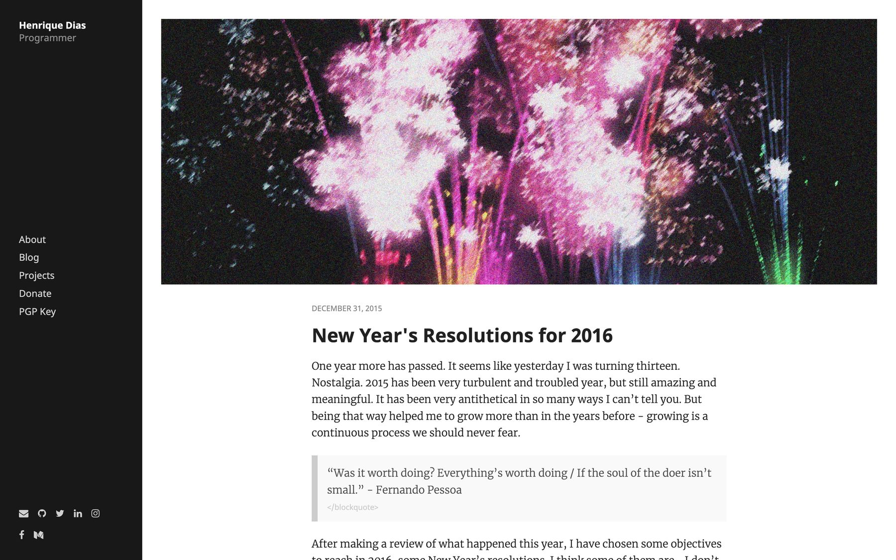
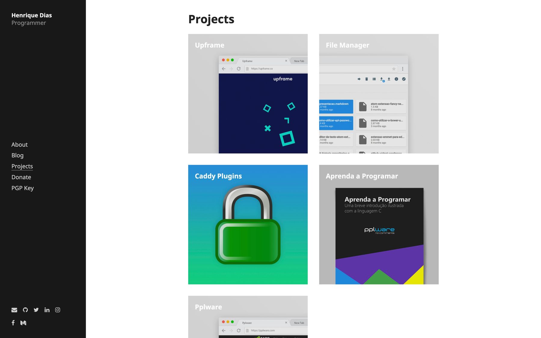
In 2017, I managed to go through the whole year with the same design (magic!). This was version 7 of my website. By this time, I decided to go with a vertical menu on the left. The homepage would also showcase some photos I took that I was proud of. Some design decisions on this version remained until very recently, such as the projects page.

2018
In 2018 I did another face wash to the website. The homepage had an effect where the sentence bellow my name would change every few seconds. The animation was as if it was being typed and untyped.

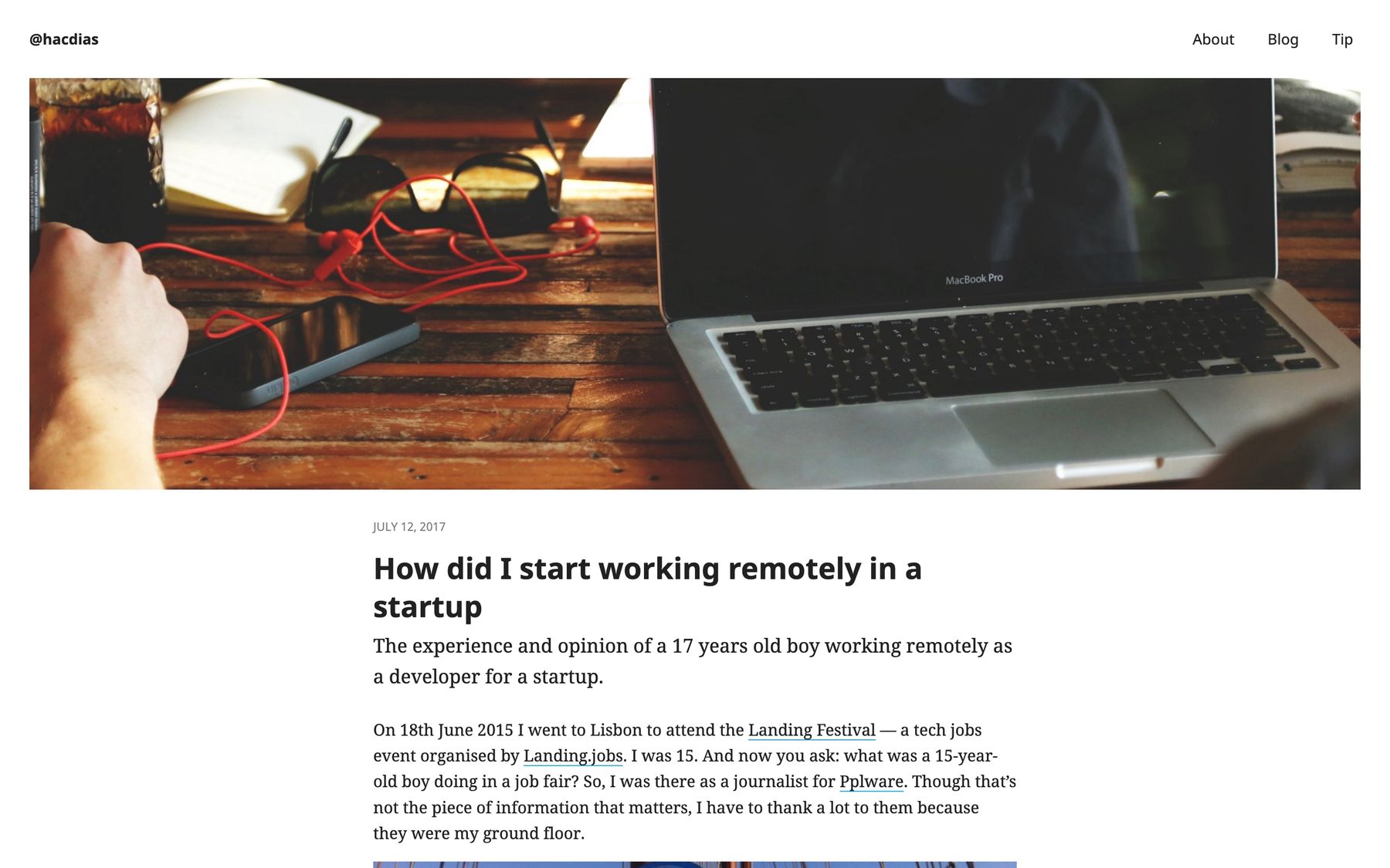
Some months after I released version 9 where I went back to the 2018 design, but with some twists. It is very similar, but there’s a different color palette and effects.
2019
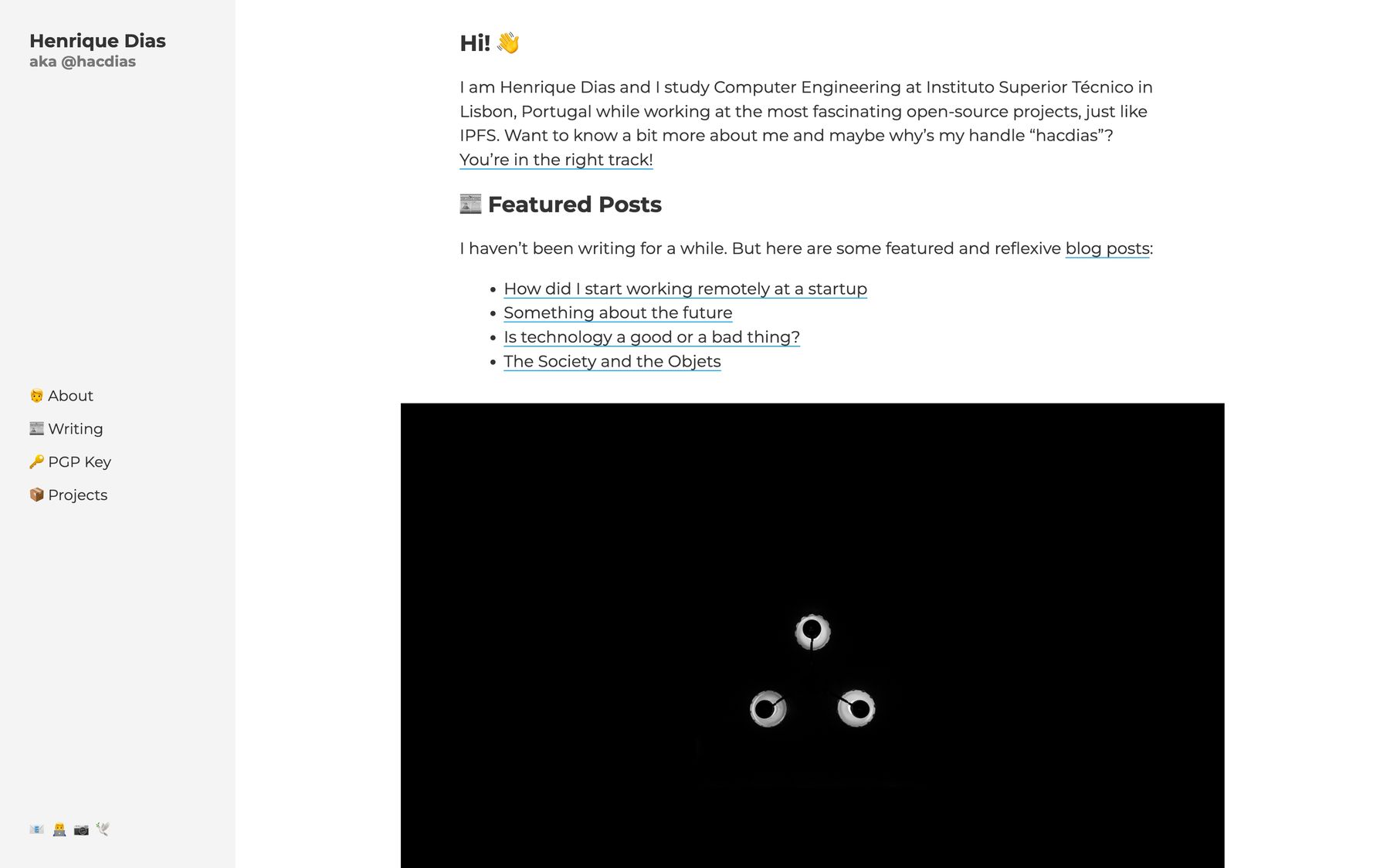
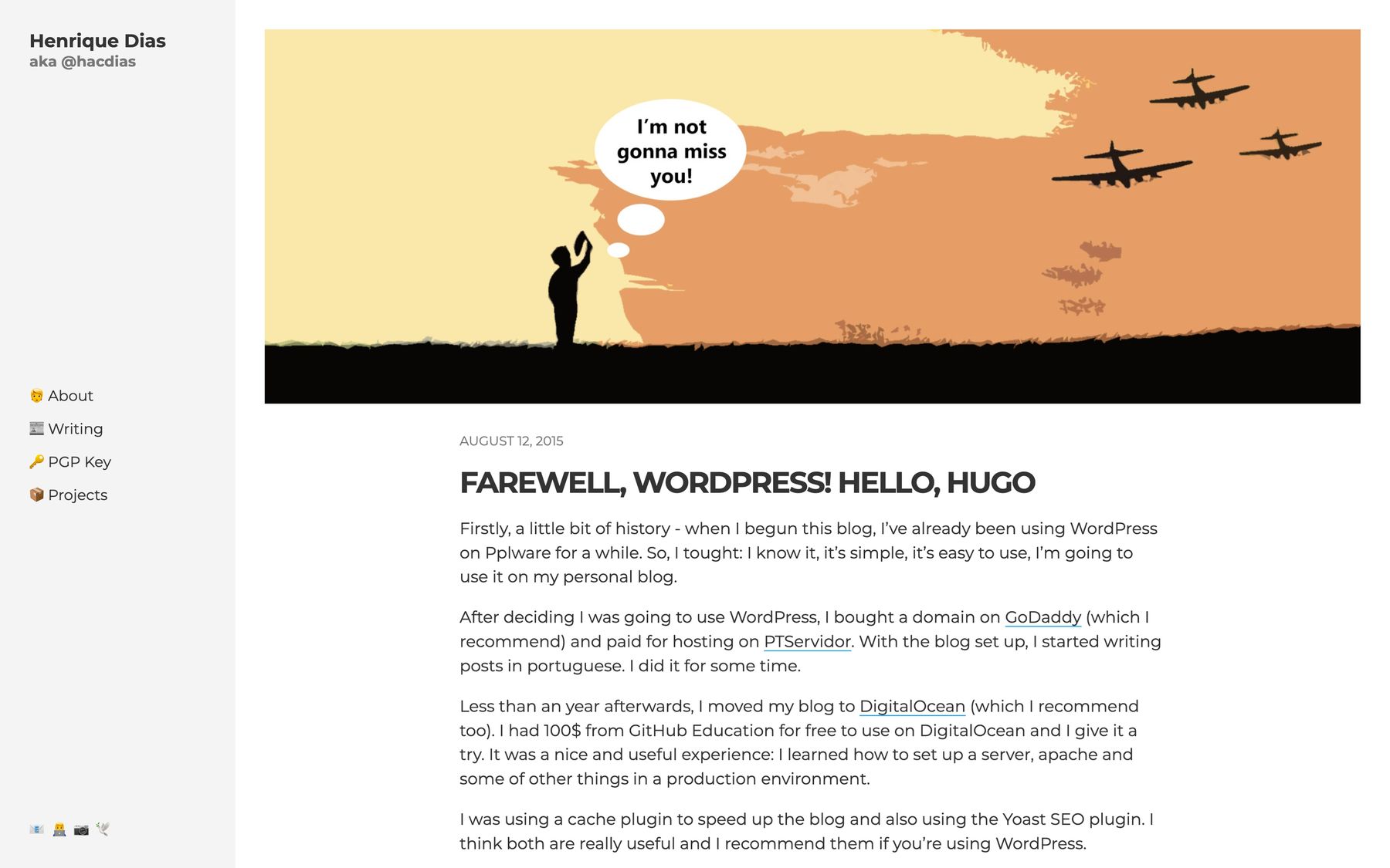
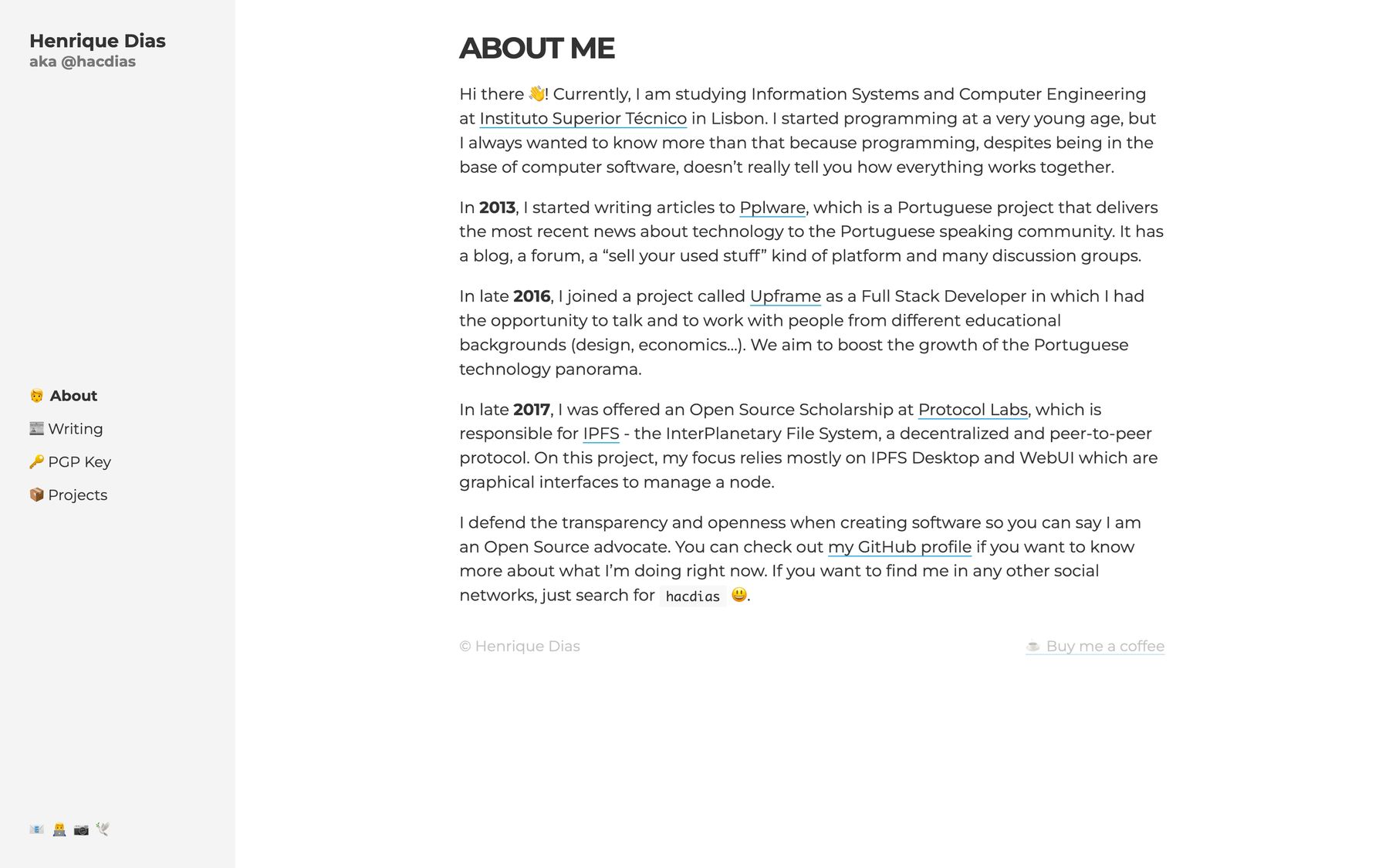
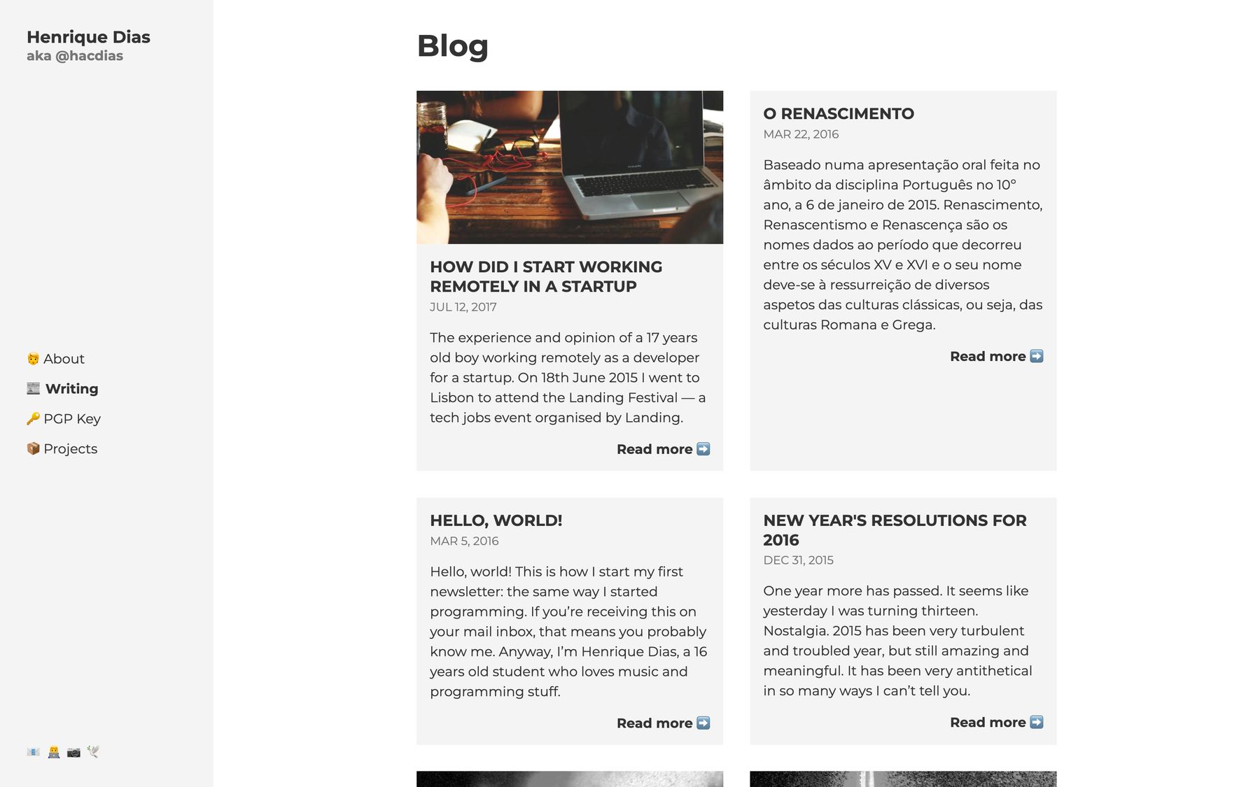
2019 is the last year of this post. In this year, version 10 was released. It was very simple. You can now see that my usage of emojis is growing - which remains until today.
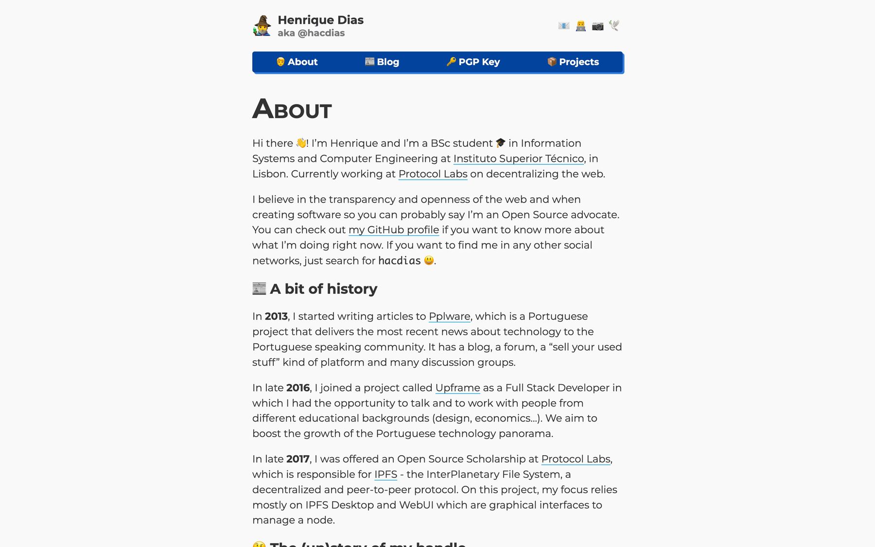
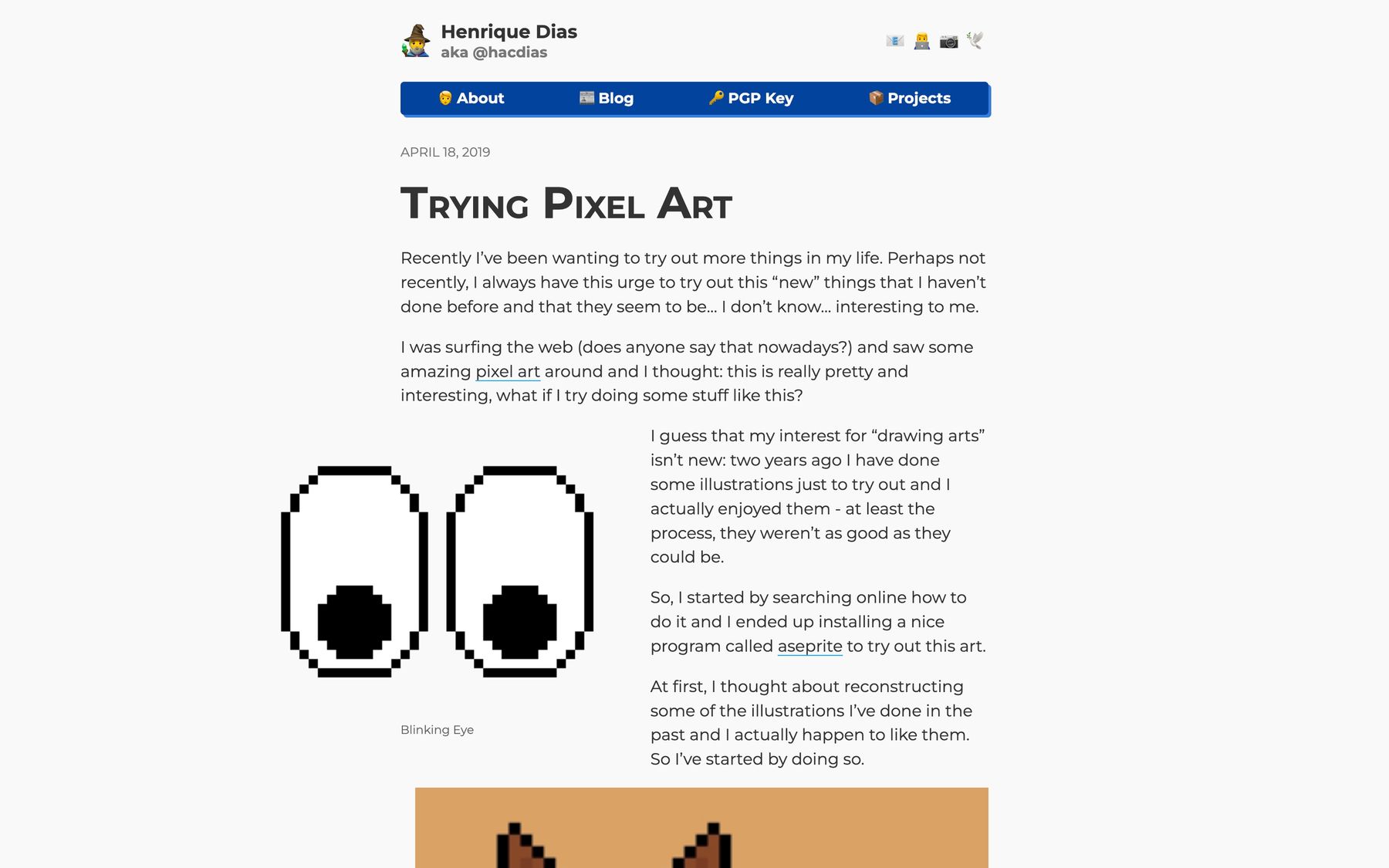
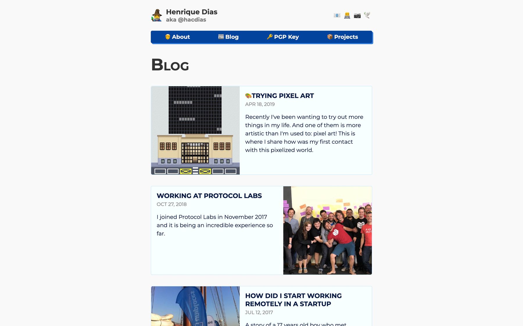
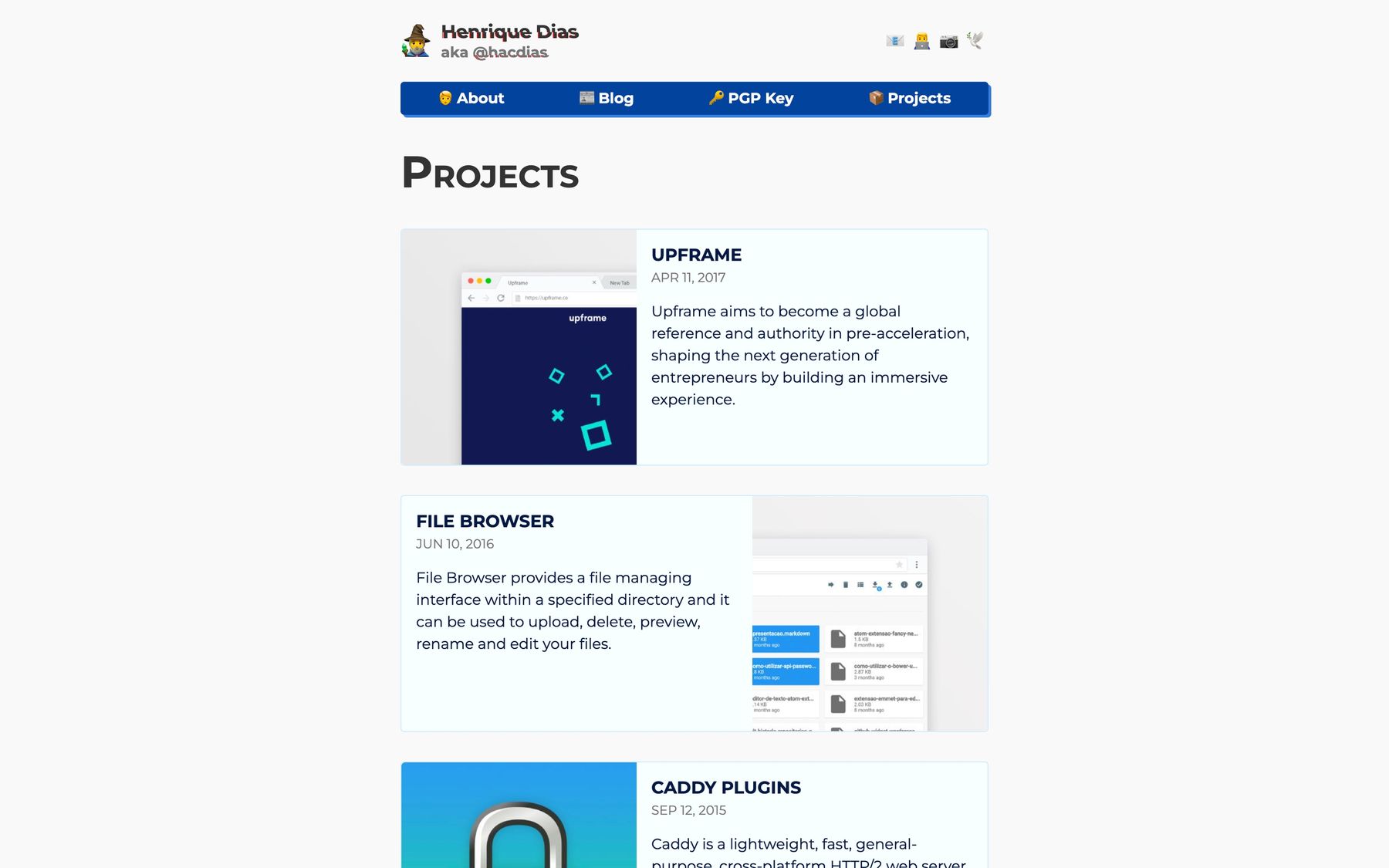
I hope you enjoyed this post. I wanted to document and have images of the previous versions of this website to be able to revisit them. Soon, I will release a new post showcasing all the remaining versions that I developed after getting into the IndieWeb community.
