My Website After IndieWeb
PermalinkA few months ago, I released an article where I showed most versions of my website before I started integrating IndieWeb into it. I think it is nice to have an overview of how your website evolved with time. So today I present to you all the major changes to my website after IndieWeb.
When I released the other post back in March, I created this one and put it into my drafts. However, it clearly went to oblivion and months went by. Today I checked my drafts page and what I could finish. So, here it is: how my website evolved since I started integrating IndieWeb into it, in 2020!
2020
In the beginning of 2020, I released version 11 of my website. It started incorporating the first feature of IndieWeb, namely the notes. It was a very clean, space-filled website. I still enjoy looking at this design.
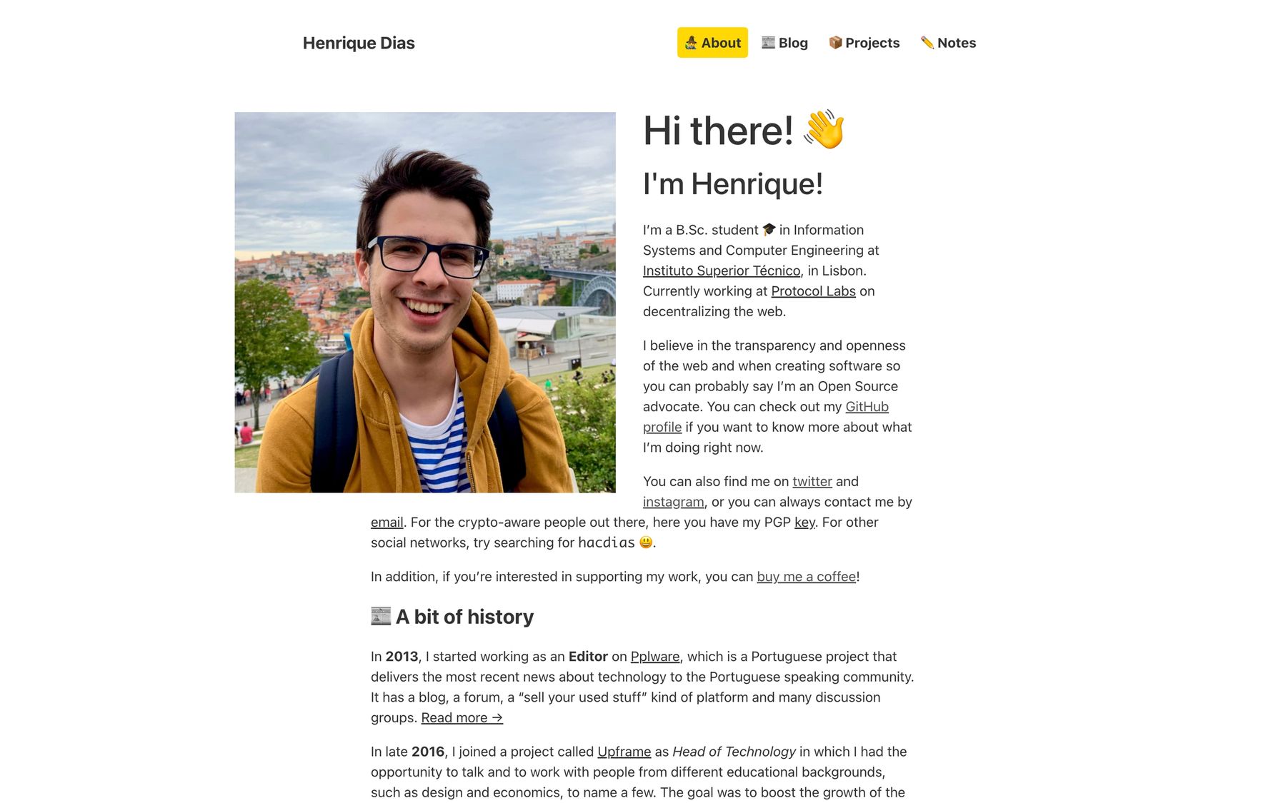
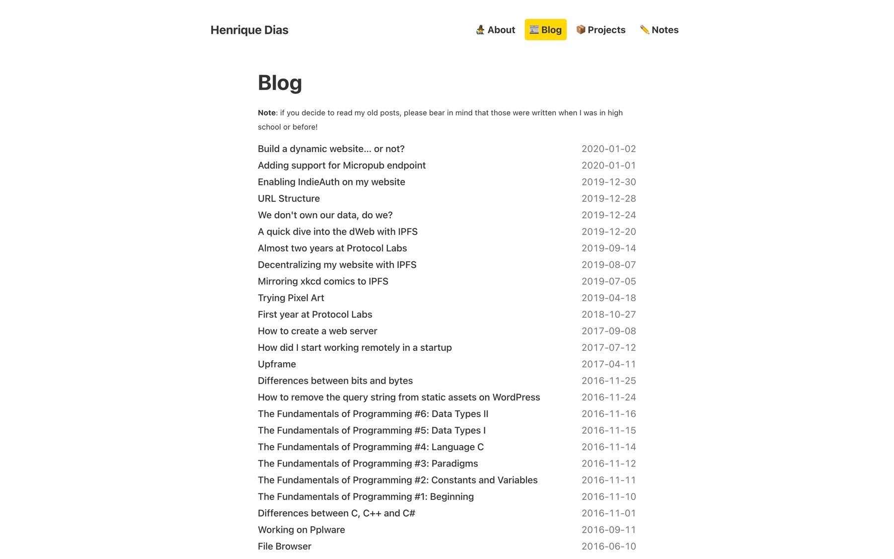
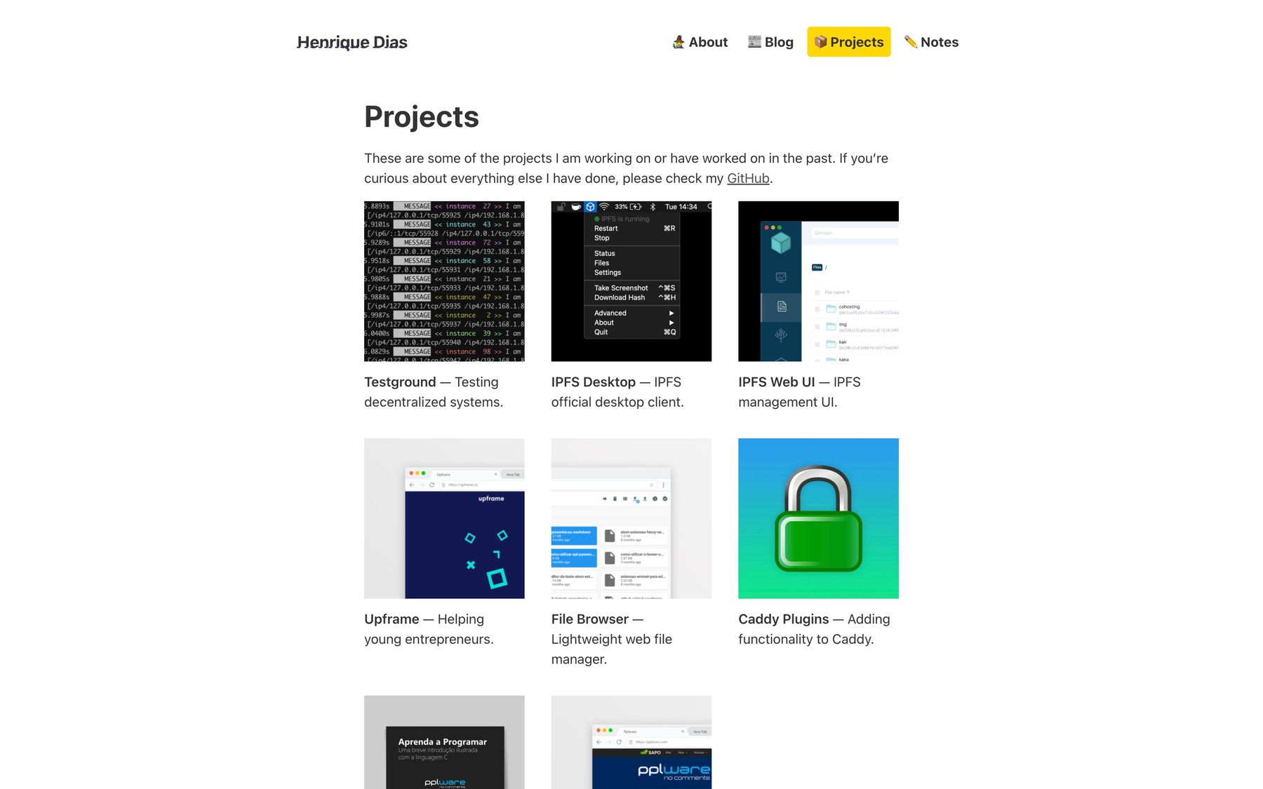
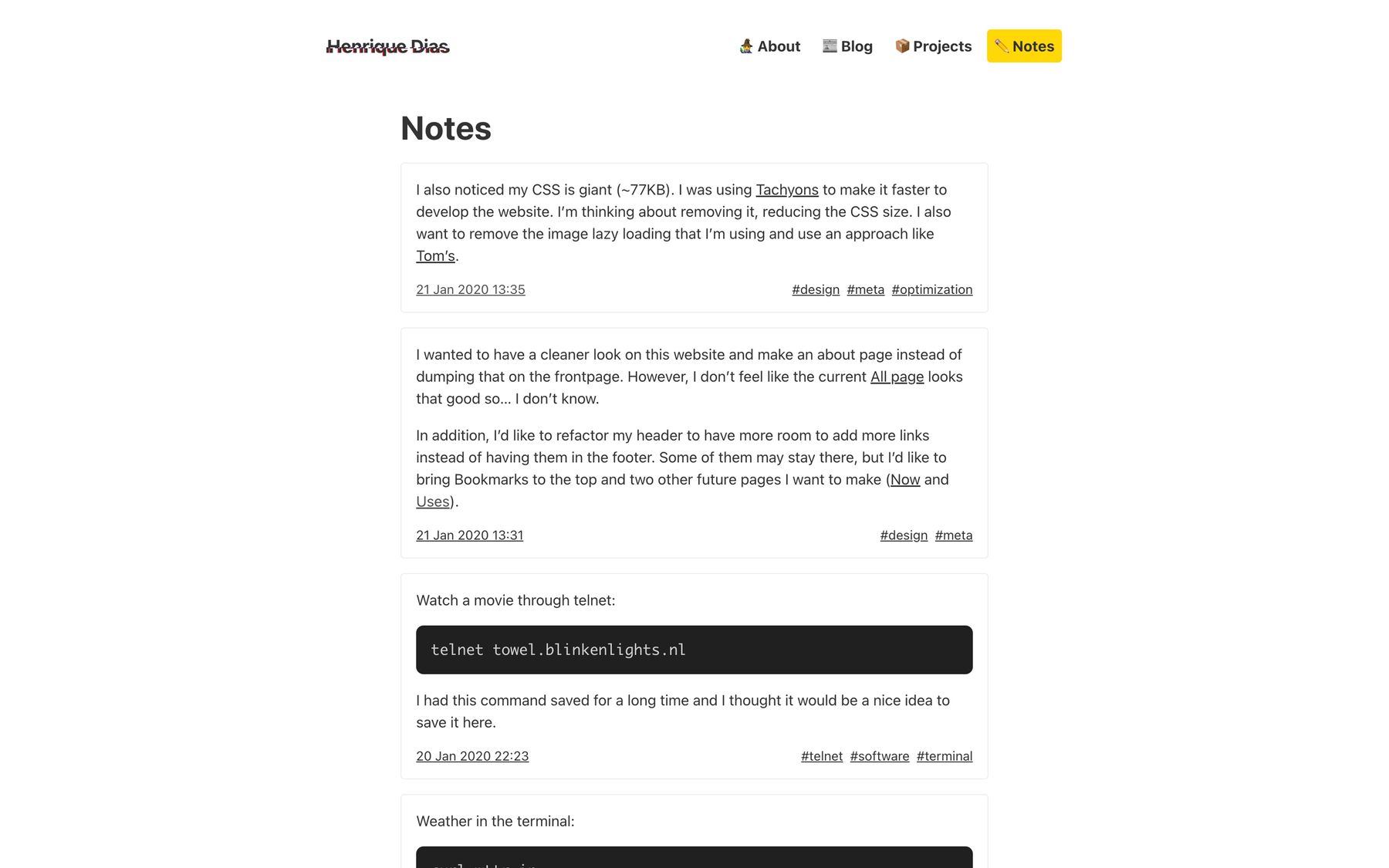
Not long after, I introduced version 12. I made a few changes inspired by other websites and version 10 of my website. I also incorporated a dark mode that would detect the user’s preferred colour scheme via CSS.
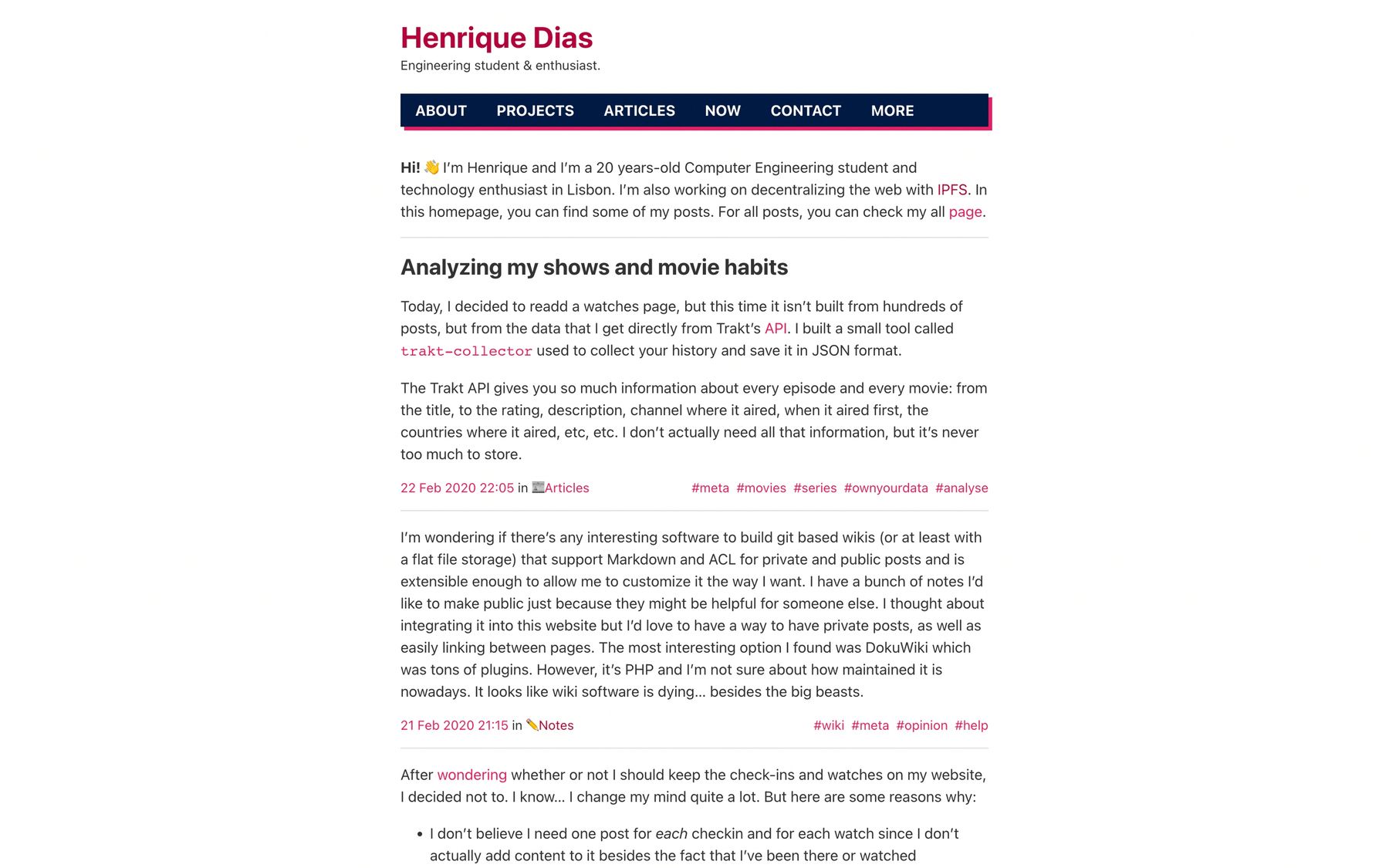
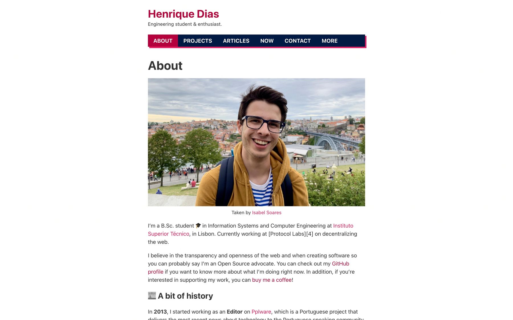
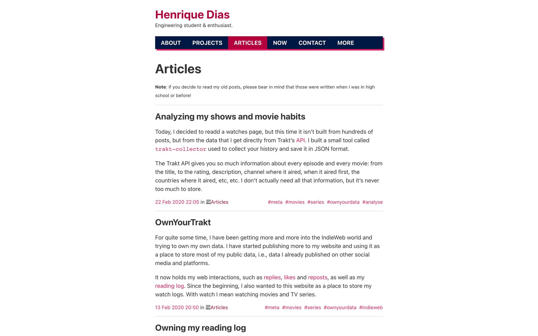
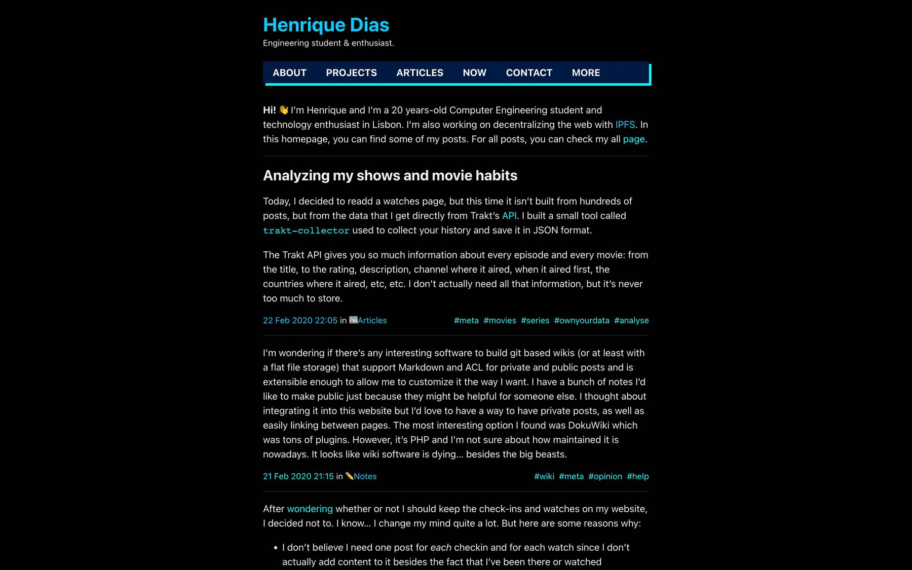
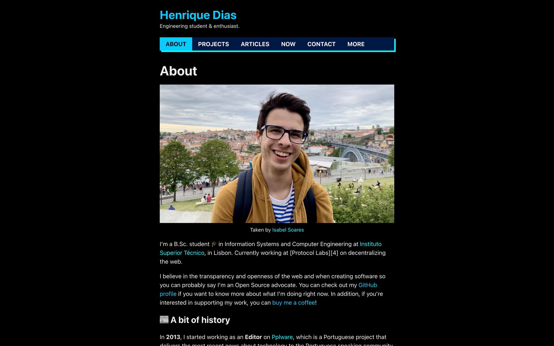
After a few iterations, version 13 was released. It is quite similar to version 12 in what I wanted it to be. The changes are mostly style related. You can also note that this is when I decided to have a knowledge base - there’s a kb link on the header. After some time, I ended up removing this page as it did not work out for e.
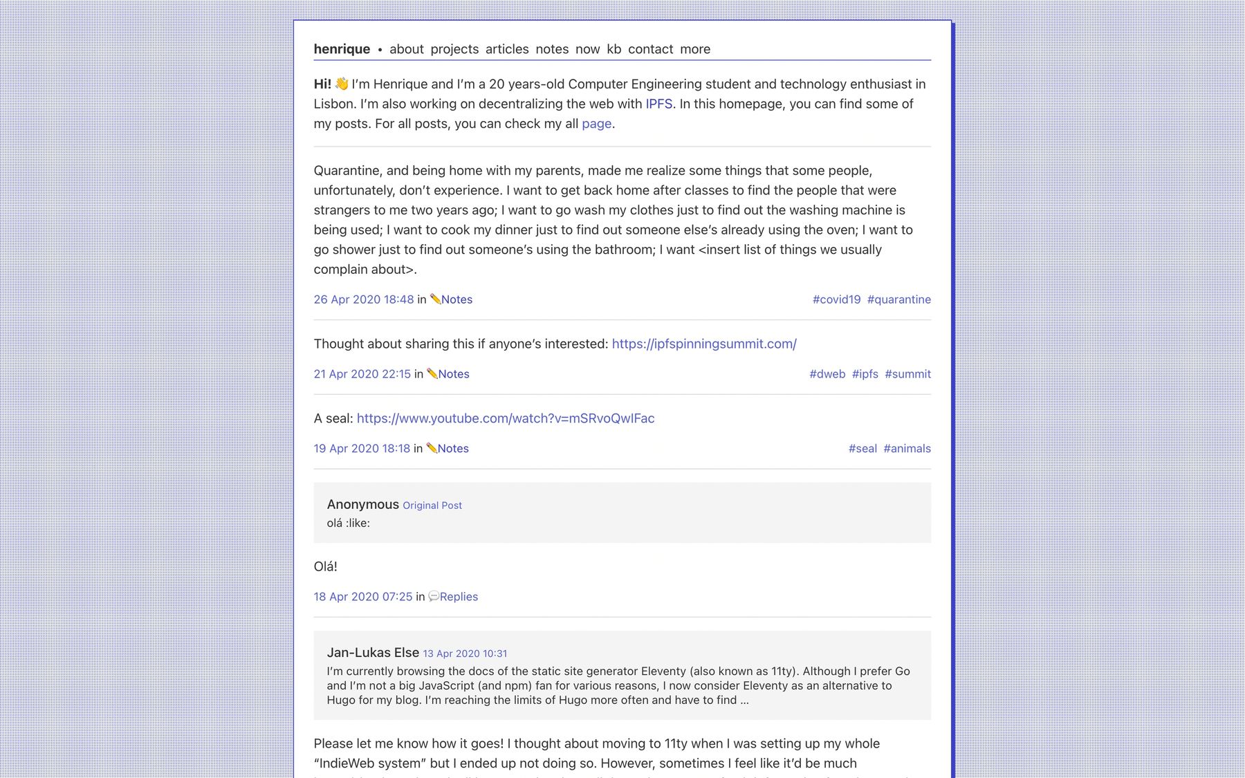
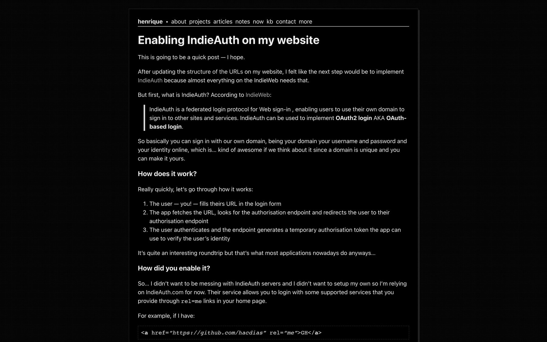
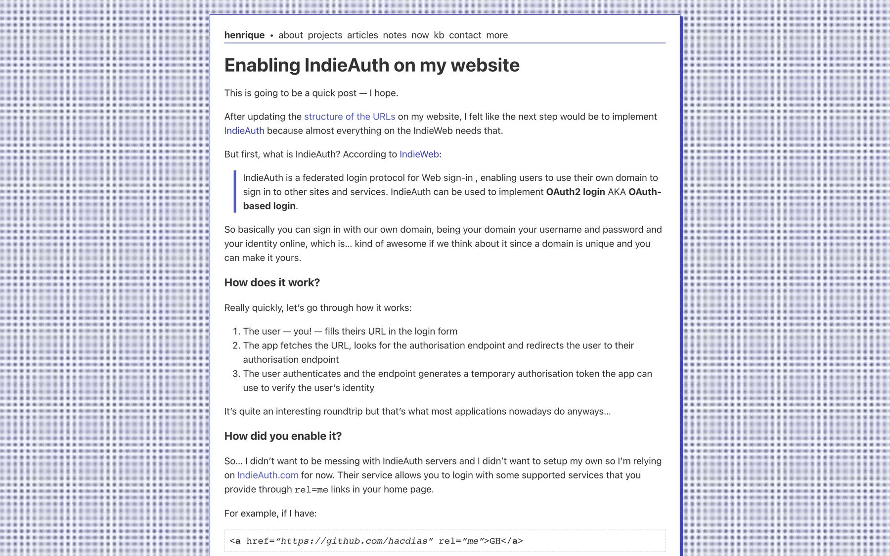
Onto version 15: I really don’t know what happened to version 14. Since I took this screenshots in March, perhaps I didn’t manage to run version 14 or it was too similar to 13 or 15 and I decided not t o post about it. Either way, here we can see a very similar design style compared to previous iterations, but more clean.
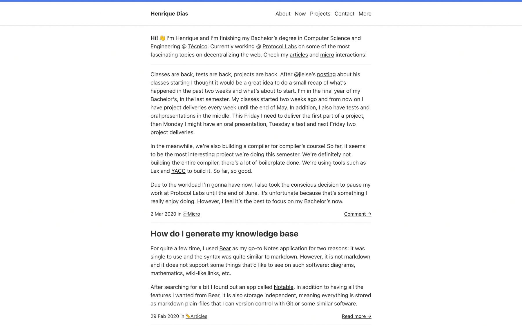
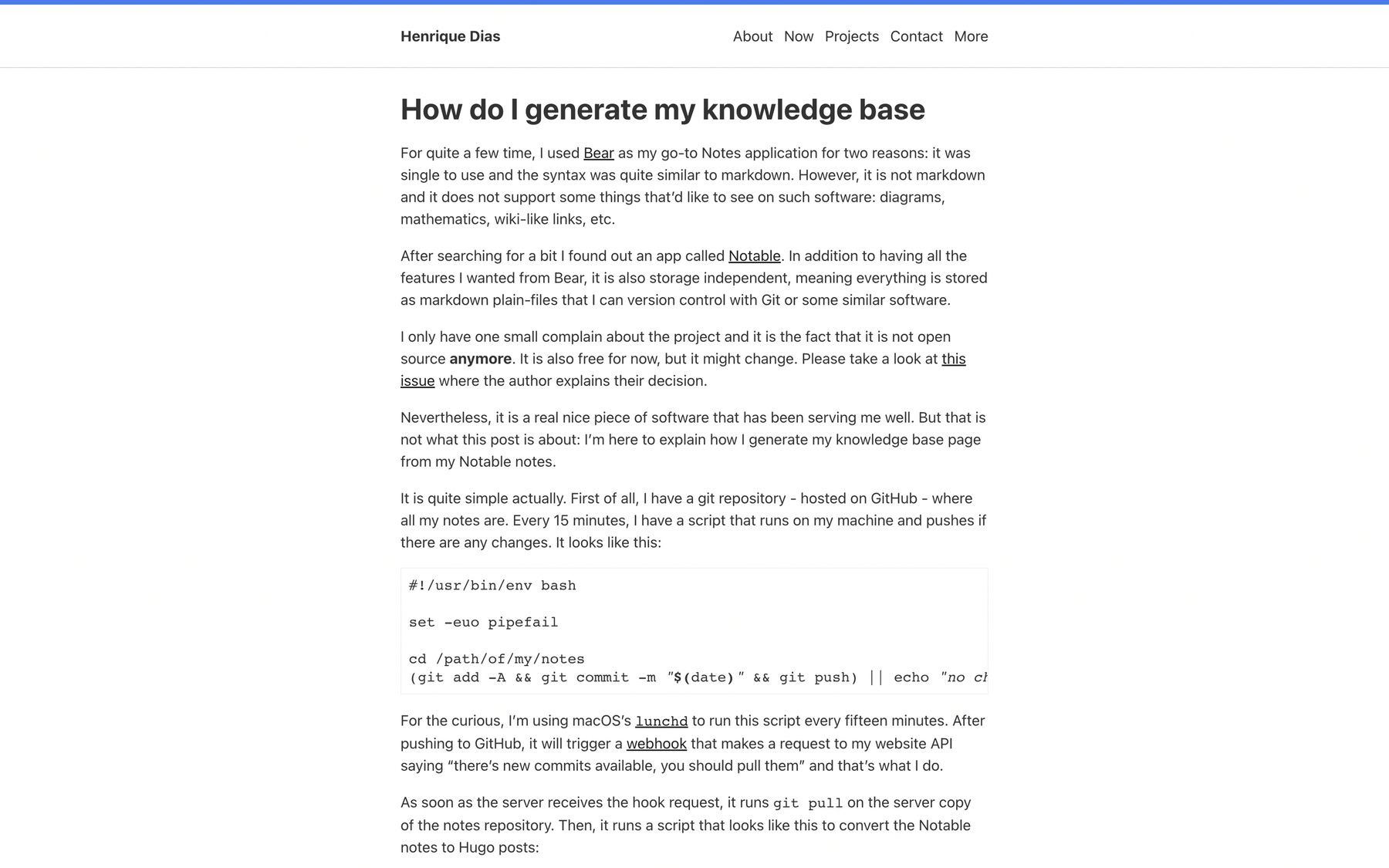
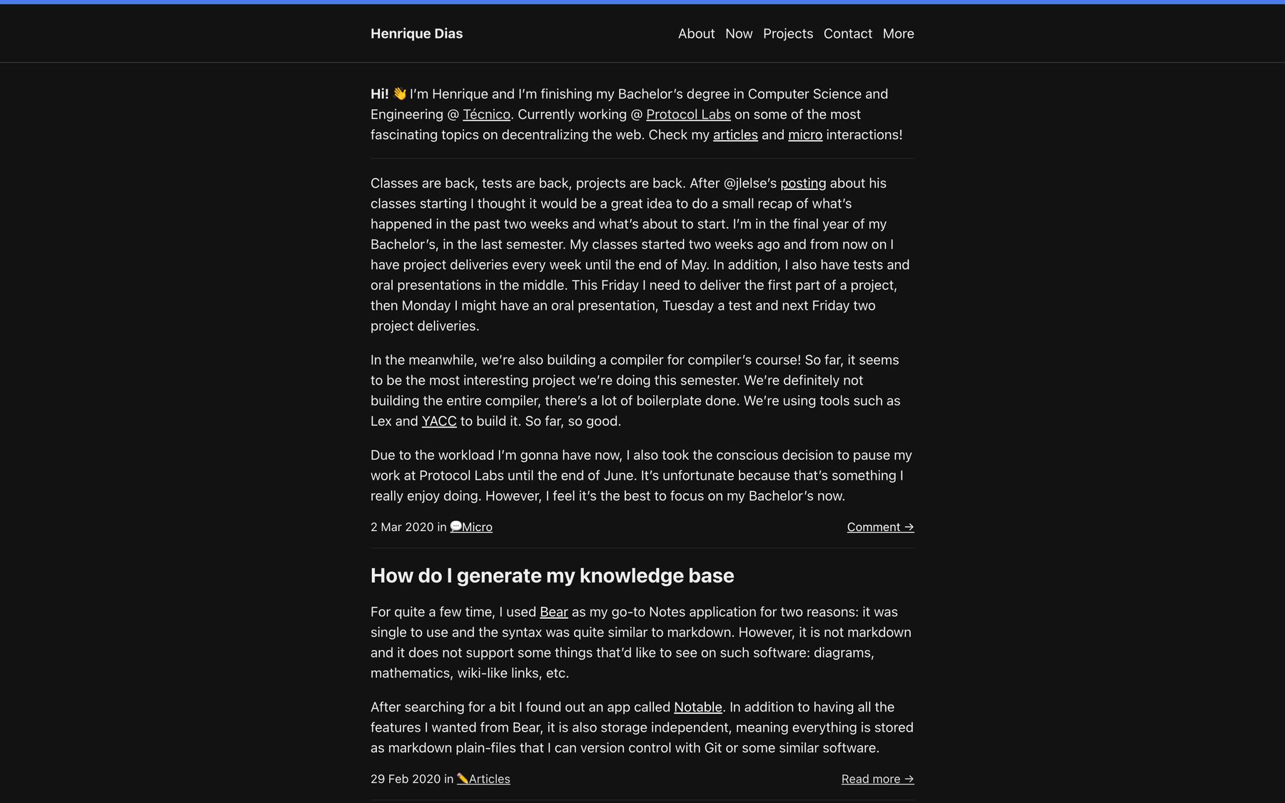
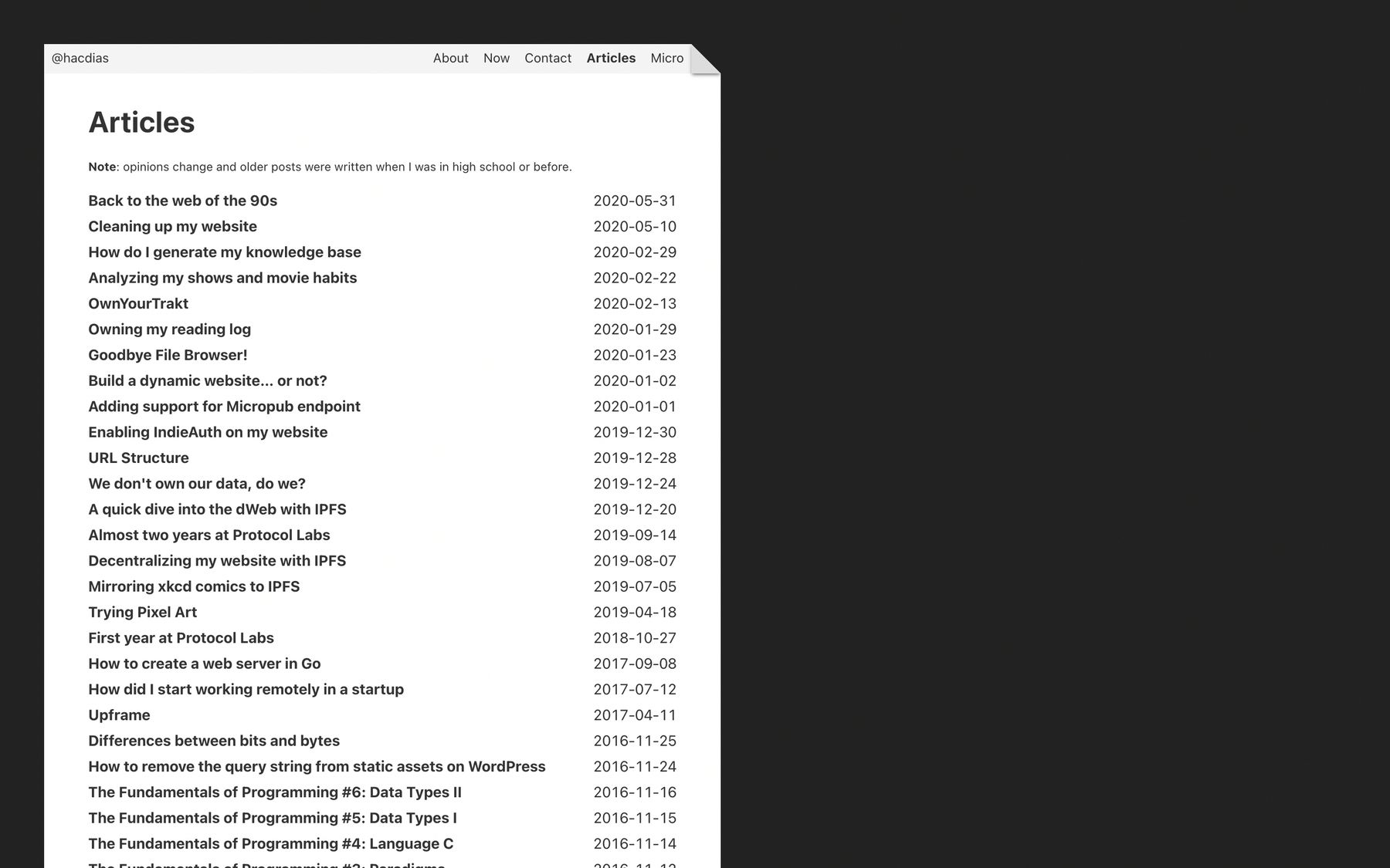
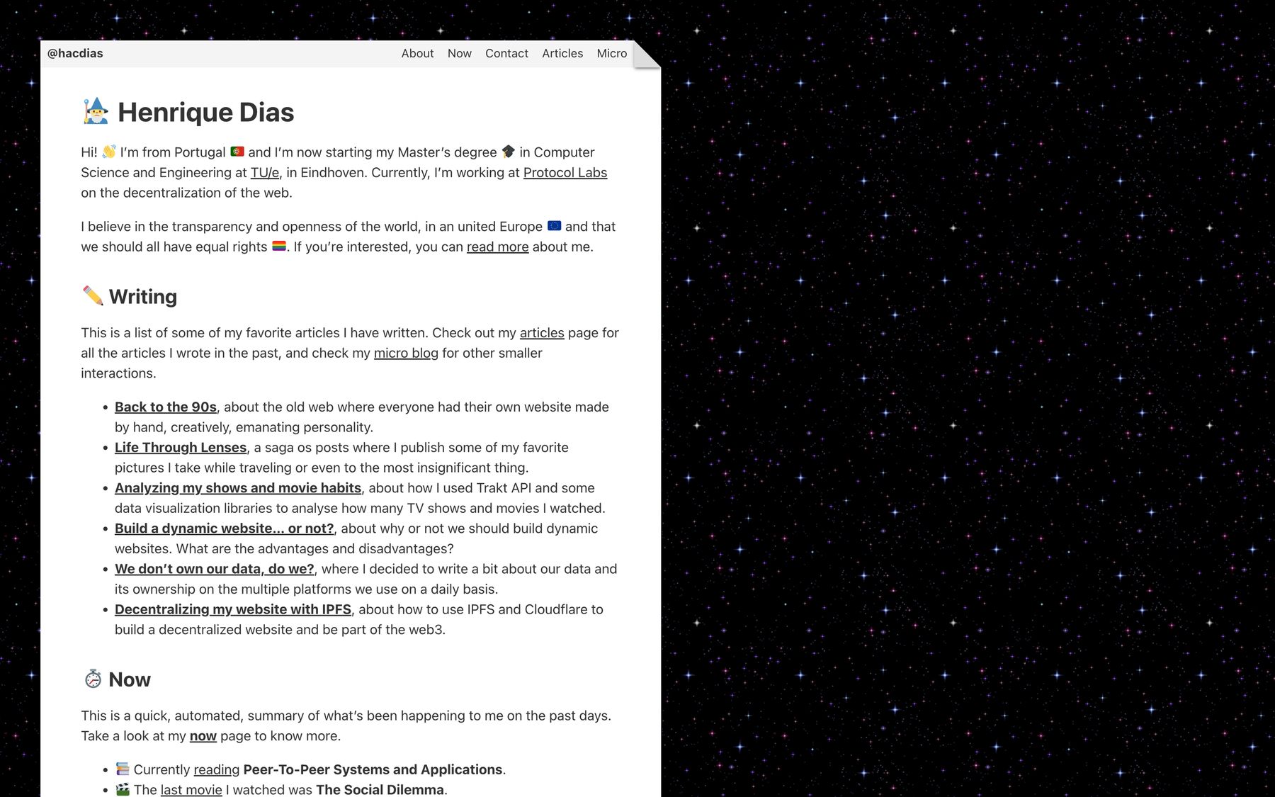
Later in the year I decided to go back to the 90s and got immensely inspired on this website. My website’s pages looked like actual paper pages and I started playing with backgrounds and GIFs and emojis all around. Some of this things are still around!
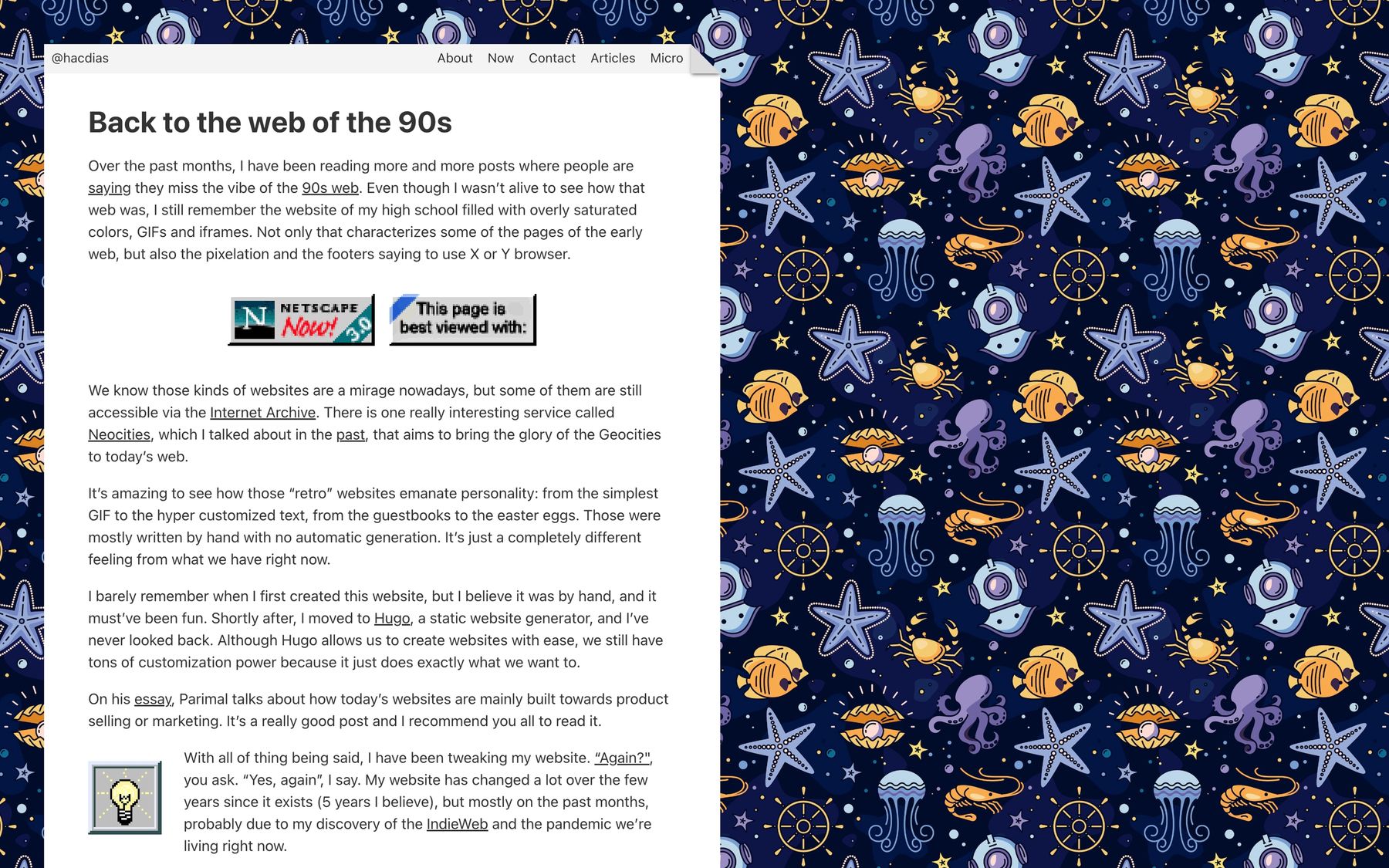
2021
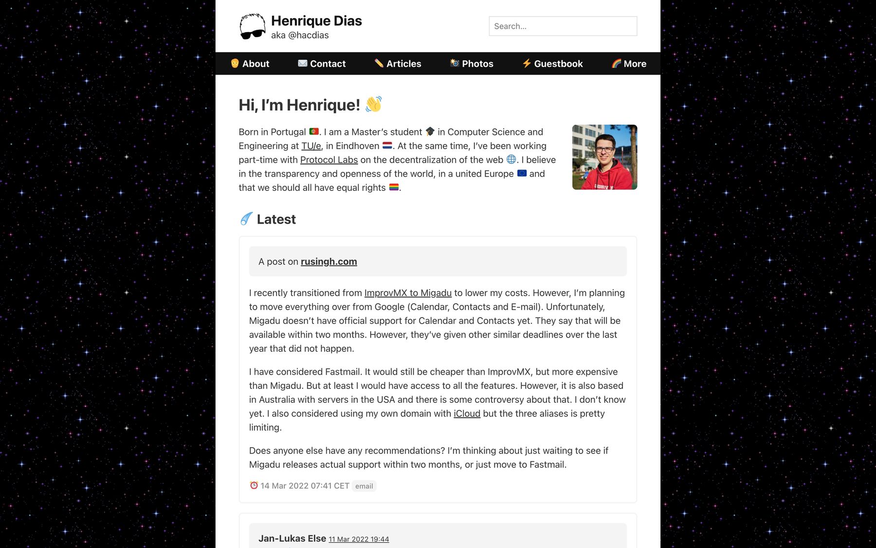
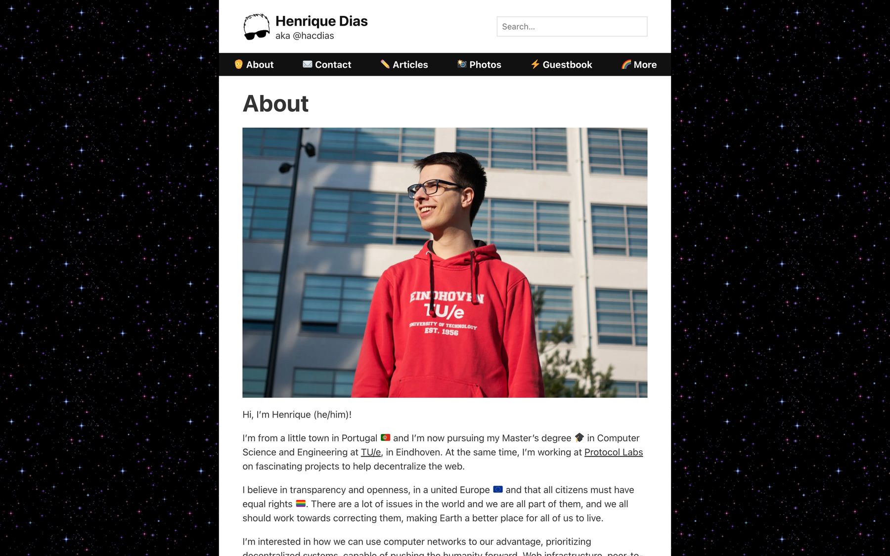
After so many deep changes thorough 2020, I reached a style for 2021 that I kept for the whole year. From time to time I would make slight changes and modifications, but this is what probably most of you remember.
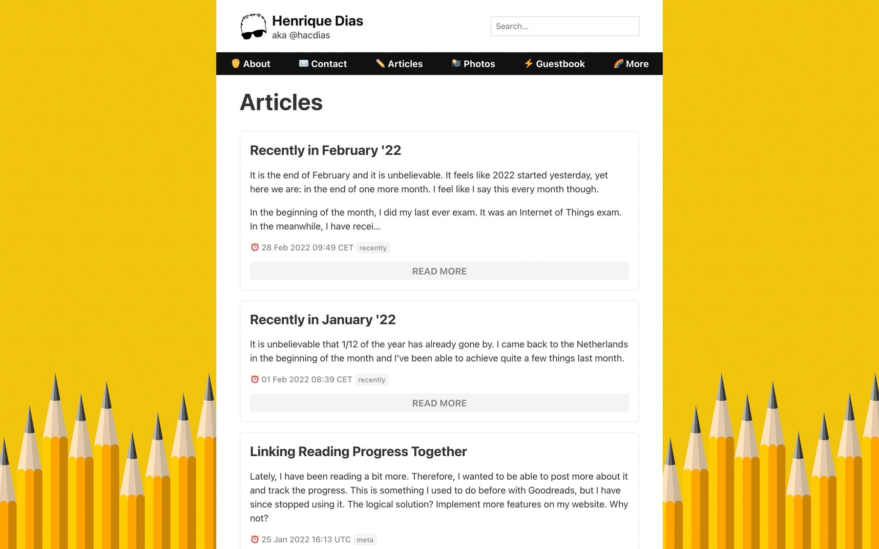
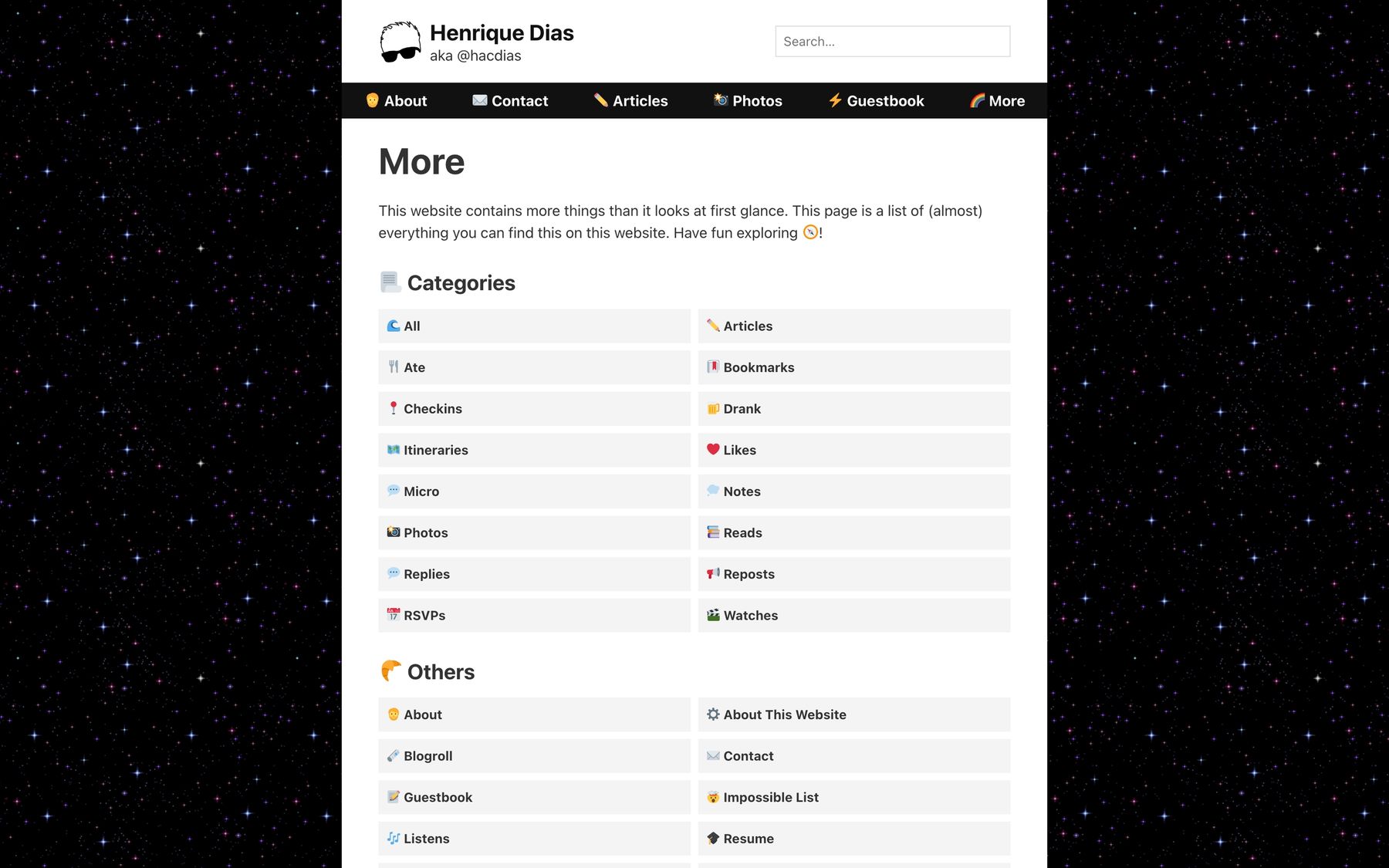
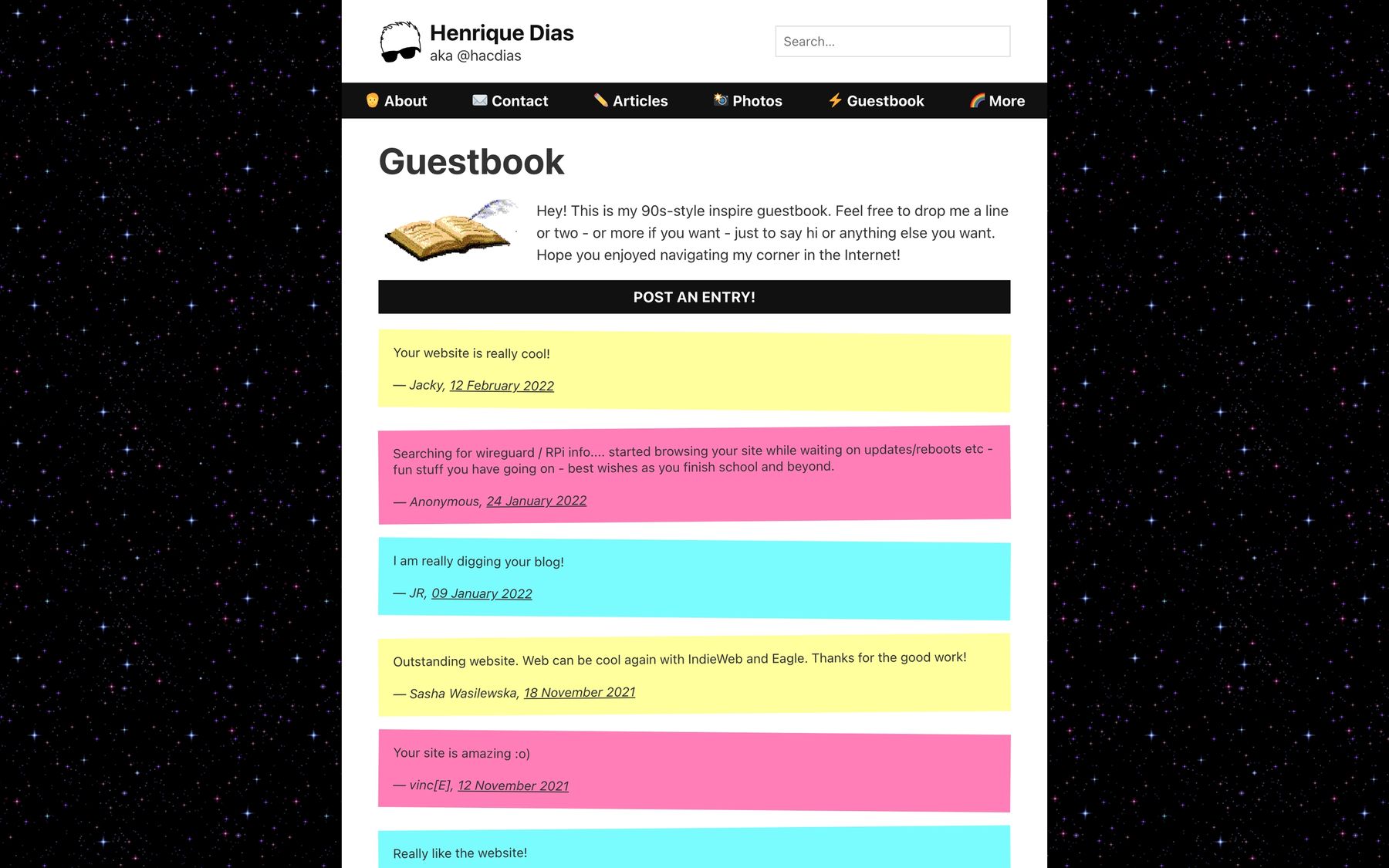
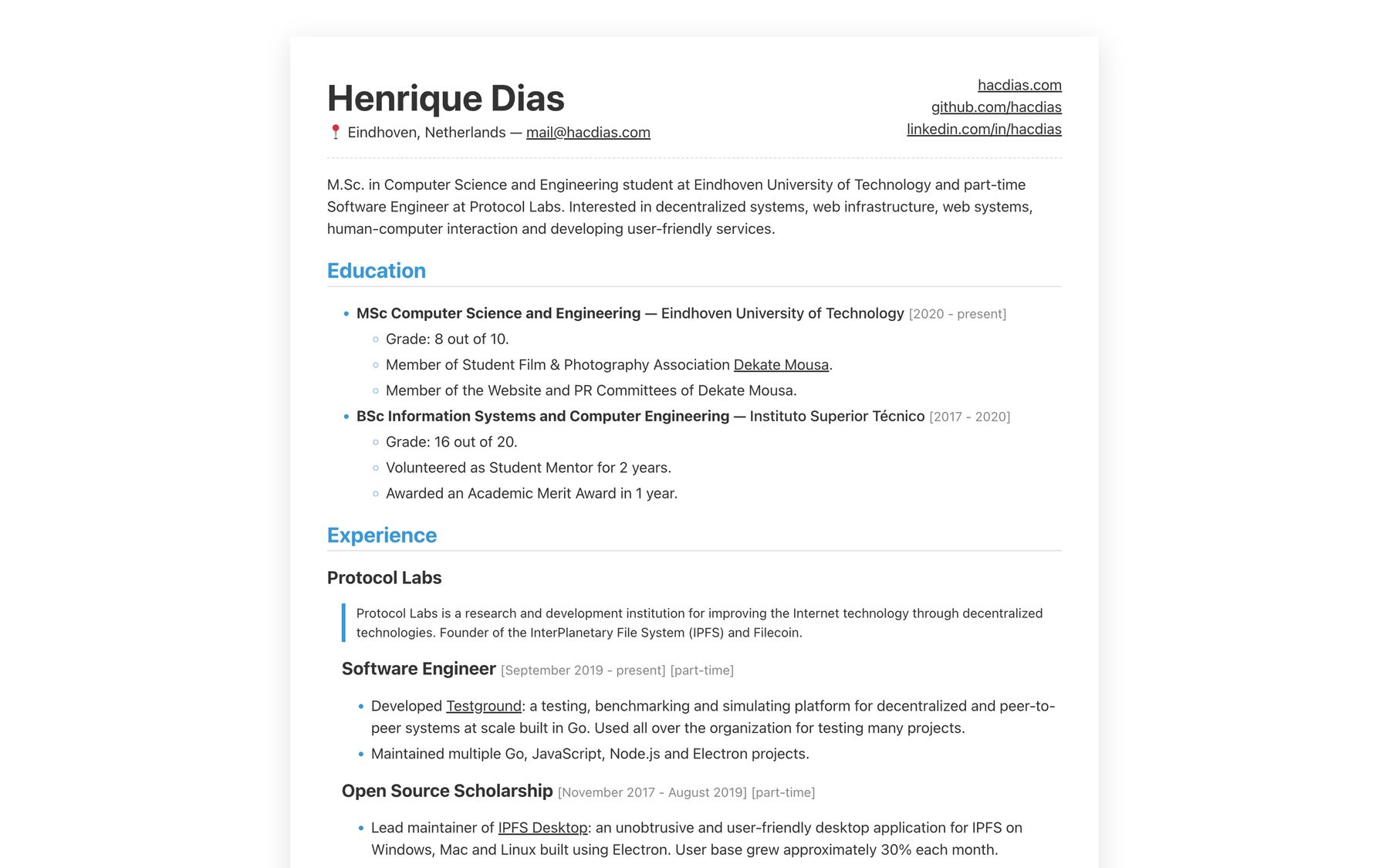
At this time, I also decided to introduce a resume on my website such that I can share it easily. In addition, it is ready to print and it looks nice printed - don’t print it though.
And we reached the end. The current iteration of this website it very similar to what you see on version 17, introduced during 2021. There are a few improvements here and there, some backgrounds removed, some corners are rounded. But the spirit is still the same! I hope you enjoyed this post to see how this website evolved over the years!
