Small Elements From My Website Inspired by Others
PermalinkToday I bring something not as conventional: a post about certain elements of my website you could say that are inspired or borrowed from other websites. Things that I found fascinating and included in my website too over the time. Let’s go!
Sticky Year Header
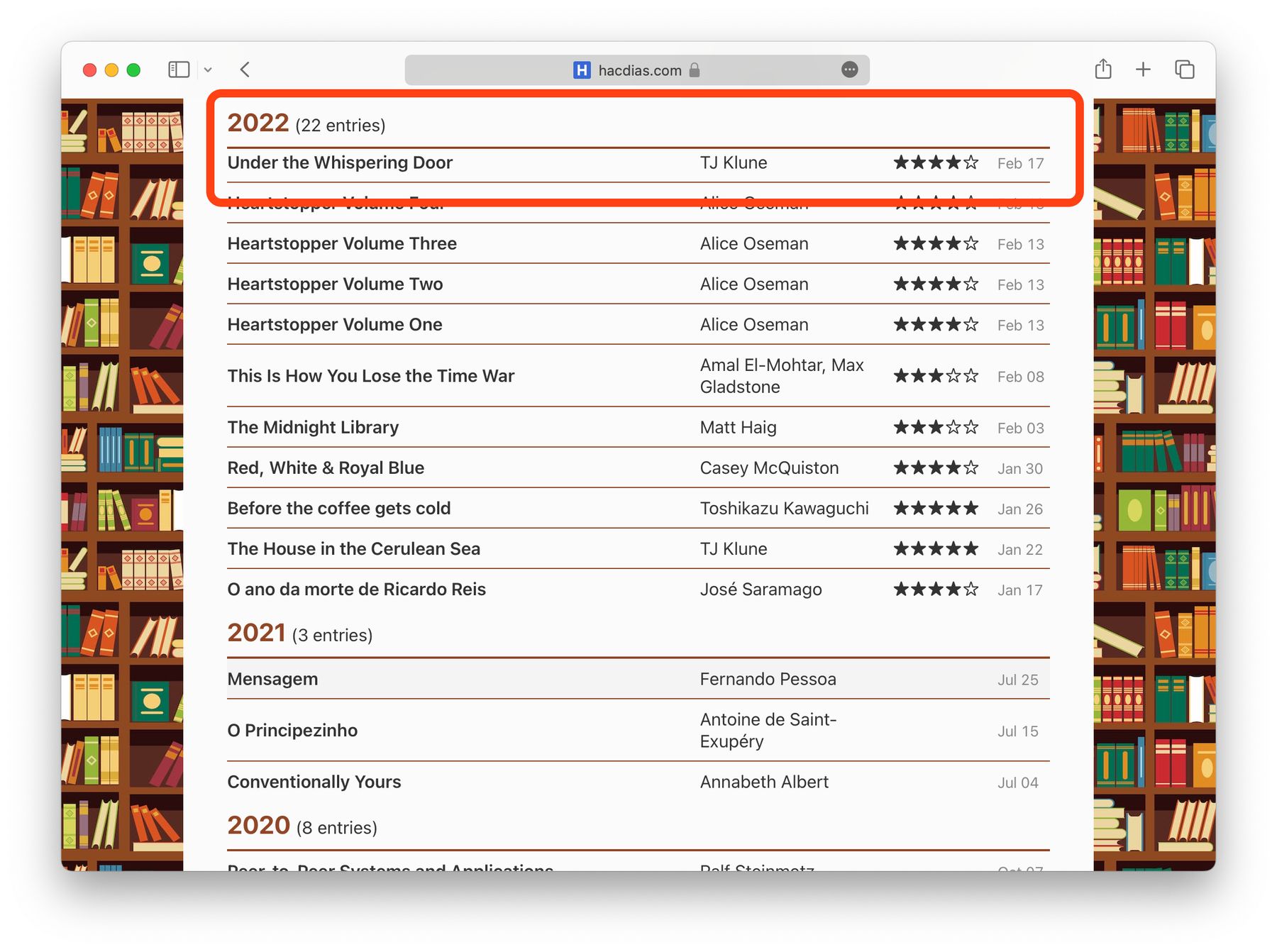
The first element of my website I am going to go over is the sticky headers. These sticky headers can be found in different pages. Usually, these pages present chronologically ordered content grouped by year, such as ✏️ Articles, 🚆 Trips and 🎬 Watches.

I first saw these headers on Tim’s website, who, just like myself, has a few content listings, such as the blog, but also log pages. When I saw these sticky headers I thought they were quite fascinating. What happens is that when you scroll, the current year header is “stuck” on the top of the page and therefore always visible.
Easter Egg Emoji on Header
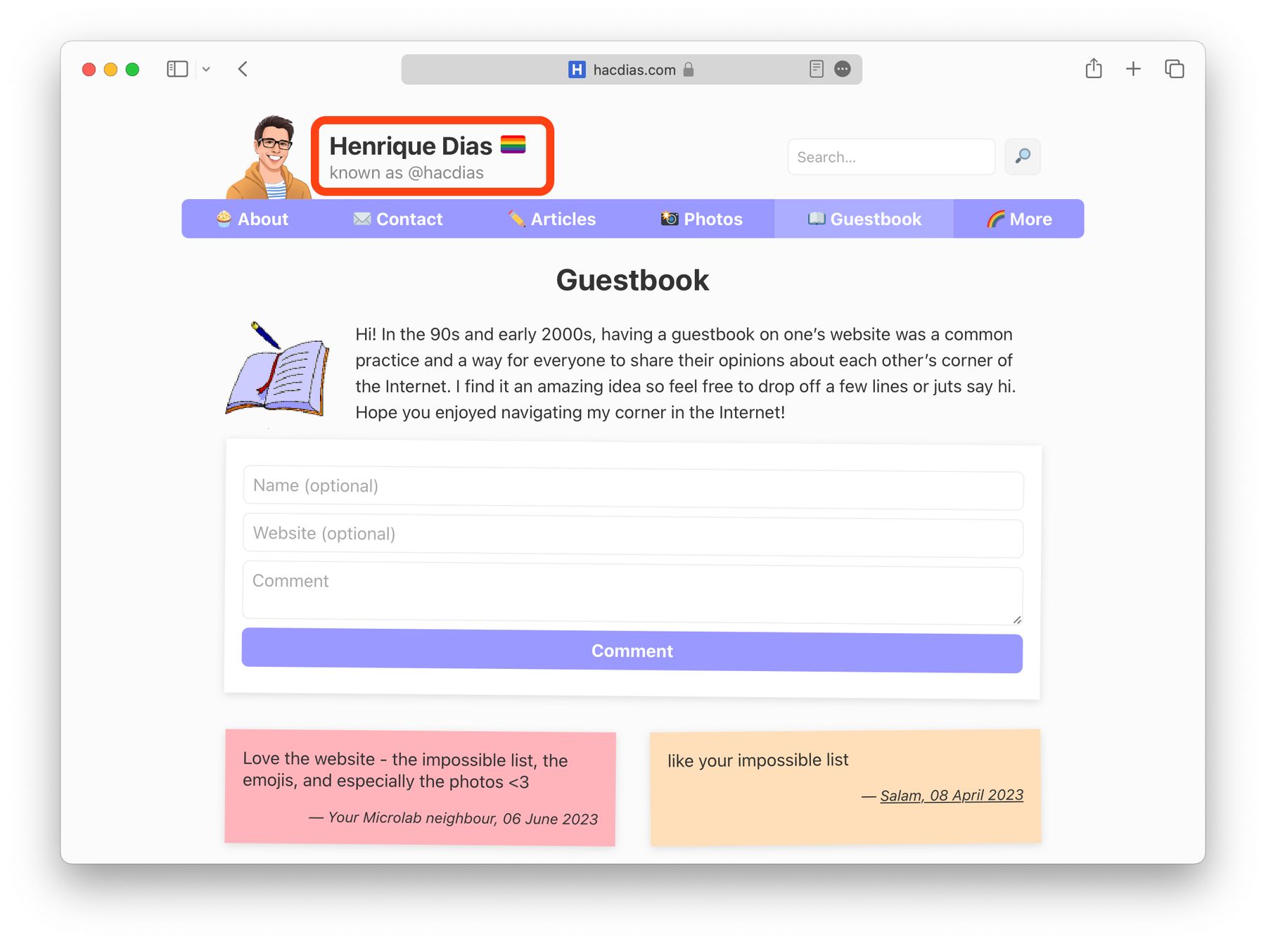
The header of my website usually shows a verification badge, which I already mentioned in a previous article. However, during some times of the year, or special dates, it presents something else: an emoji for example.
The first time I think I saw something like this was on Sebastiaan’s blog. For example, during his birthday, a cake emoji will show up next to his picture. I implemented something similar, but next to my name. If a special date is present, the verification badge will be replaced by something else.

For example, at the present it’s June, therefore Pride Month. So my website shows a little 🏳️🌈 next to my name. In other times of the year you might find some other, possibly more intriguing emojis, such as 🍪 and 👻. The best part is that they all have a an alternative text and title describing what exactly is happening! Note that these will only work if you have JavaScript enabled in your browser.
Homepage Posts Listing
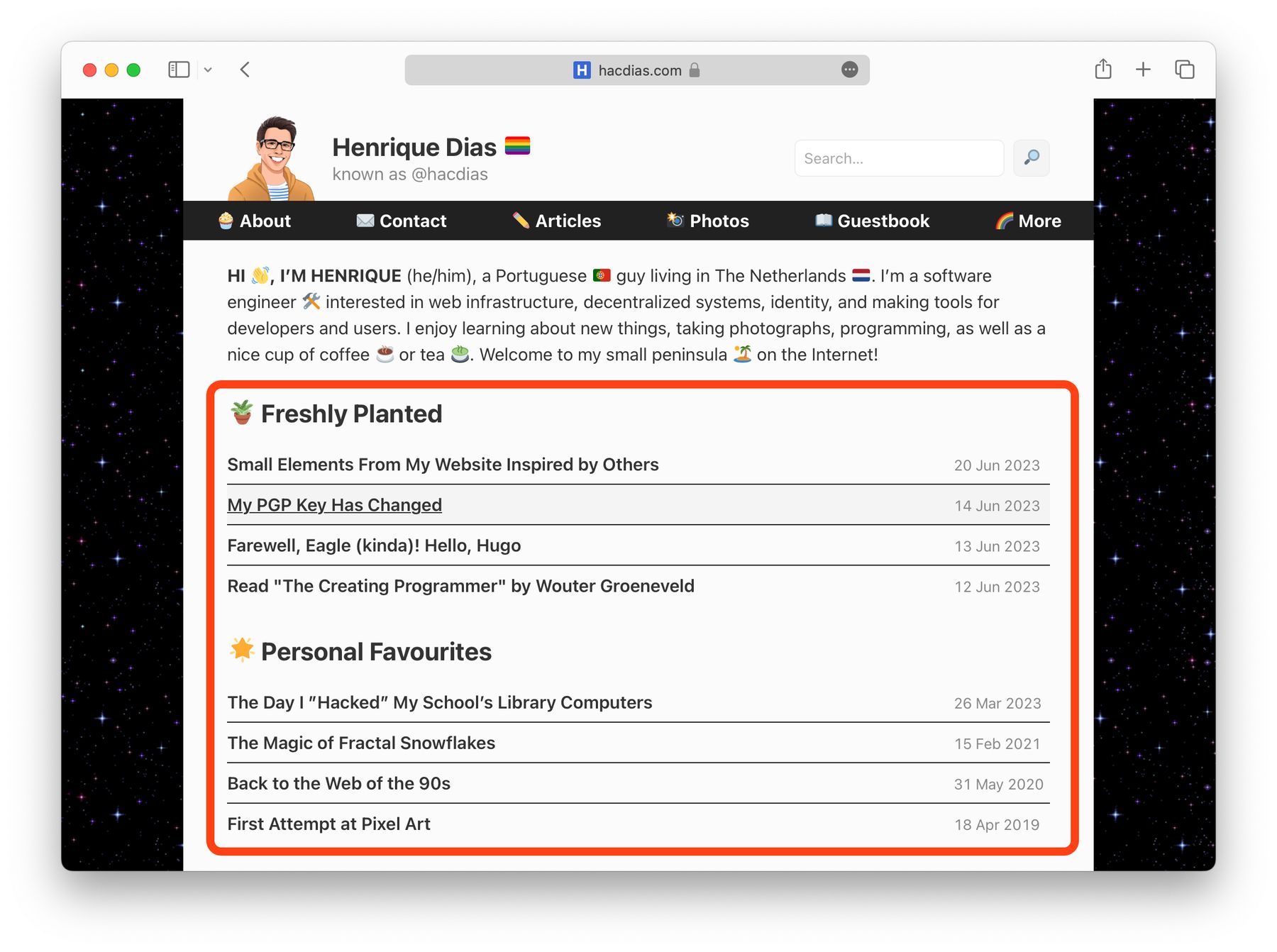
In May I made a relatively noticeable update to my homepage: I removed the regular listing of posts, in favour of a simple list with the latest 4 posts, plus 4 favorite posts. This is inspired by Jim’s blog, and it was something that has been on my list for quite some time. I want my website’s homepage to be slightly more curated than it was before. In addition, I also added some of the latest images I published.

Bookmarks Page
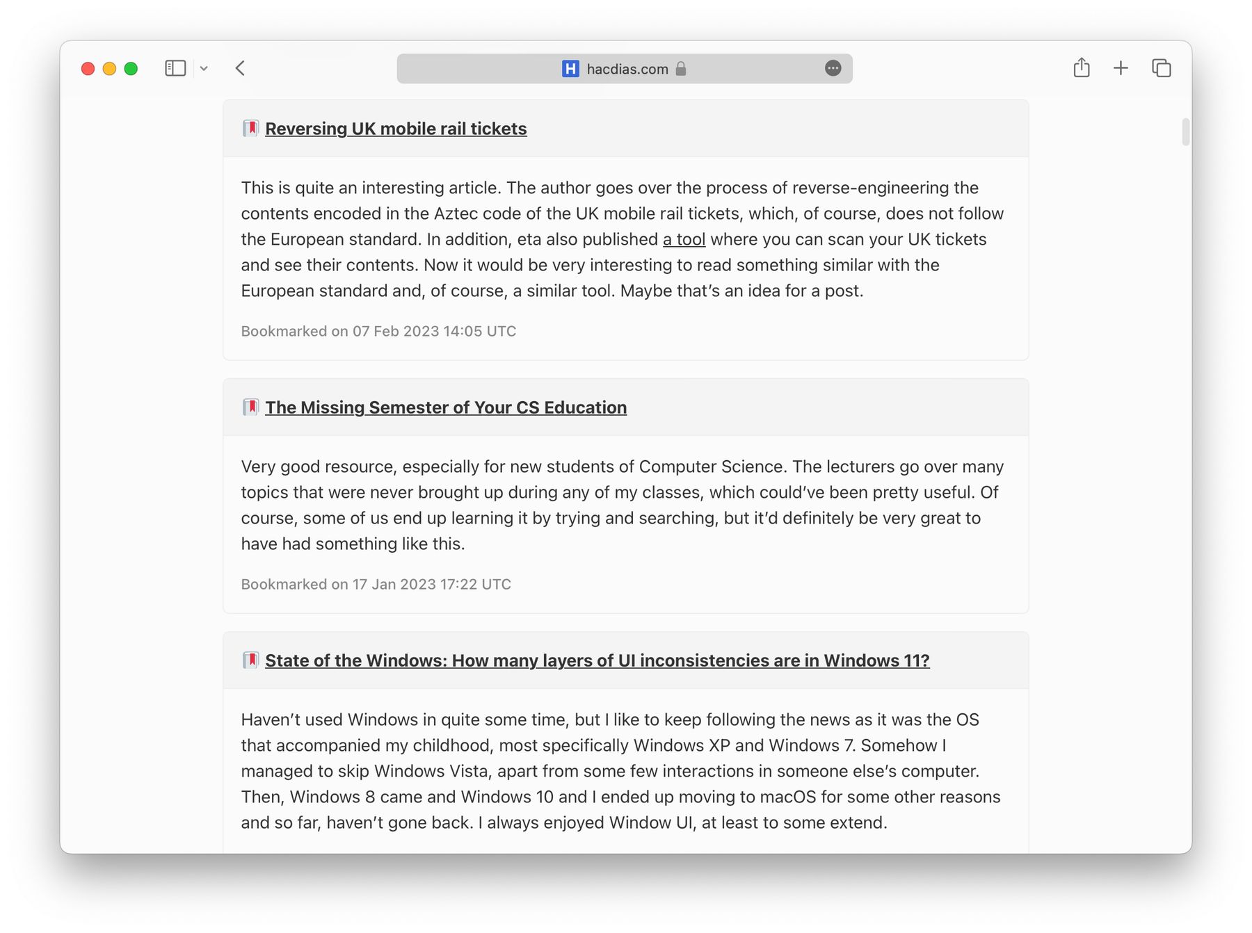
Finally, the bookmarks page. My bookmarks page is likely not yet complete and, just like anything else in this website, it can change in the future. Nevertheless, the current iteration is based on Seirdy’s bookmarks. I also “stole” a small idea from Jim’s notes where the published date is also an anchor reference. Therefore, all bookmarks are linkable.

That was all. I think it’s important to give credit to other people, specially when they’ve inspired you and you’ve used their ideas and transformed them to make your own things. I’ve mentioned things like this before and I will keep doing it in the future. It’s also a nice way to keep a record of how things looked at a certain point in time.
